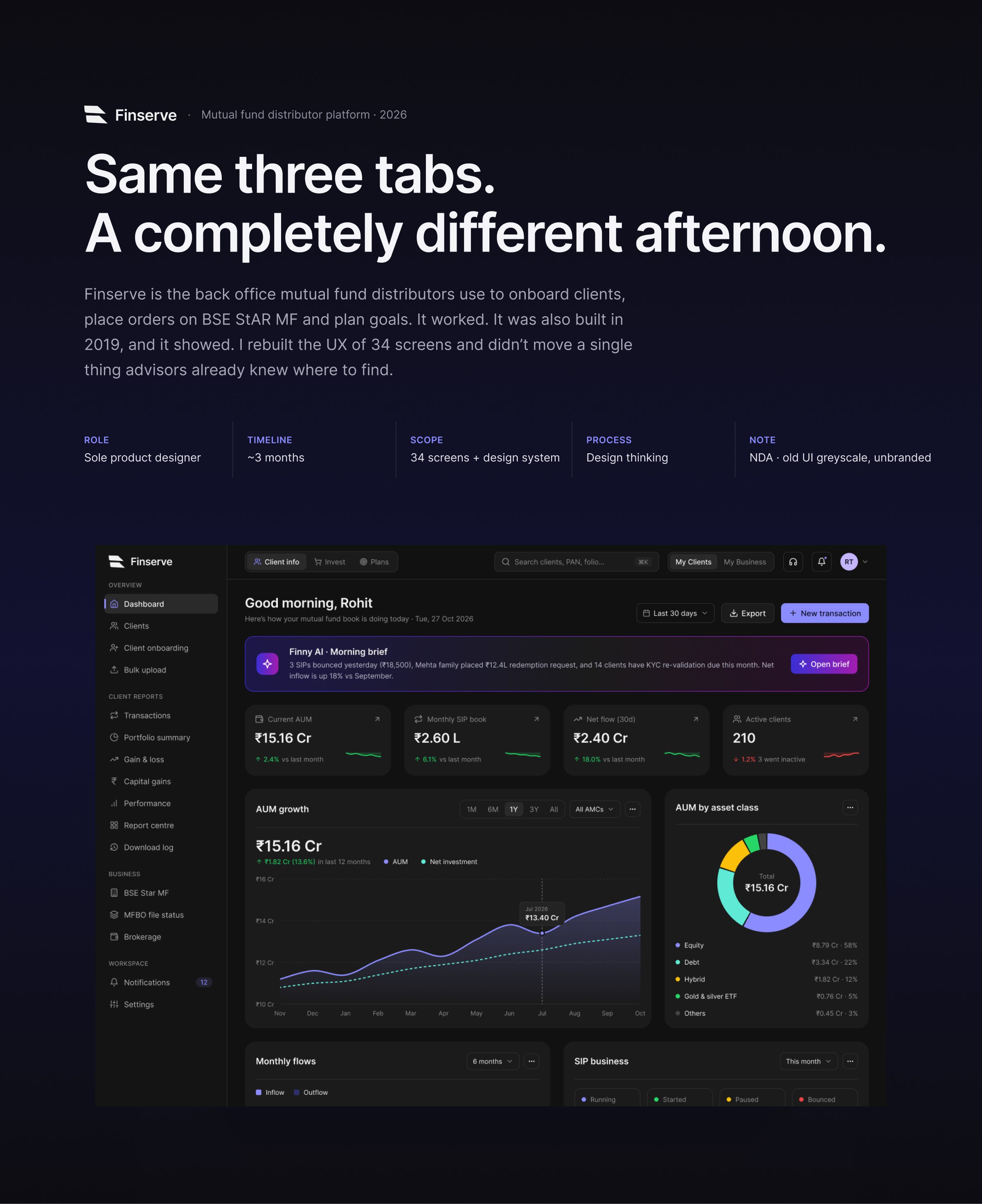
FINSERVE — Same three tabs. A completely different afternoon.
Finserve is the back office mutual fund distributors use to onboard clients, place orders on BSE StAR MF and plan goals. It worked. It was also built in 2019, and it showed. I rebuilt the UX of 34 screens and didn’t move a single thing advisors already knew where to find.
[ ROLE ]
Sole product designer · ~3 months
[ PRODUCT ]
Mutual fund distributor platform · Fintech
[ SCOPE ]
34 screens + design system · Dark theme
[ NOTE ]
NDA · old UI shown greyscale and unbranded
Case Study Format: 18 frames in 6 chapters. Click any frame to inspect it in full resolution.
Same three tabs. A completely different afternoon.
Finserve is the back office mutual fund distributors use to onboard clients, place orders on BSE StAR MF and plan goals. I rebuilt the UX of 34 screens and didn’t move a single thing advisors already knew where to find.
Click to zoom & inspect
CHAPTER 02
The problem
FRAMES 02–04
FRAME 02 // 18THE PROBLEM
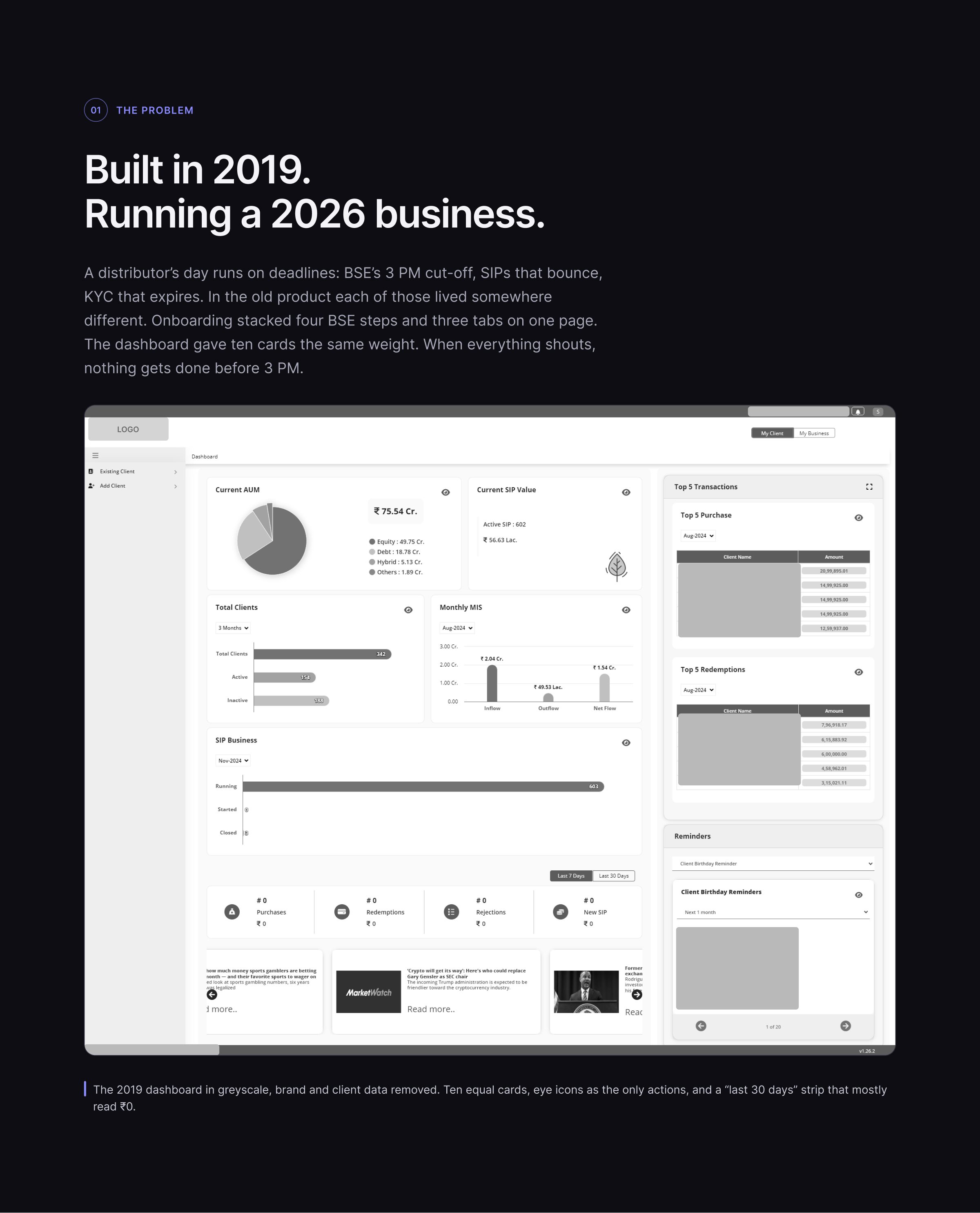
Built in 2019. Running a 2026 business.
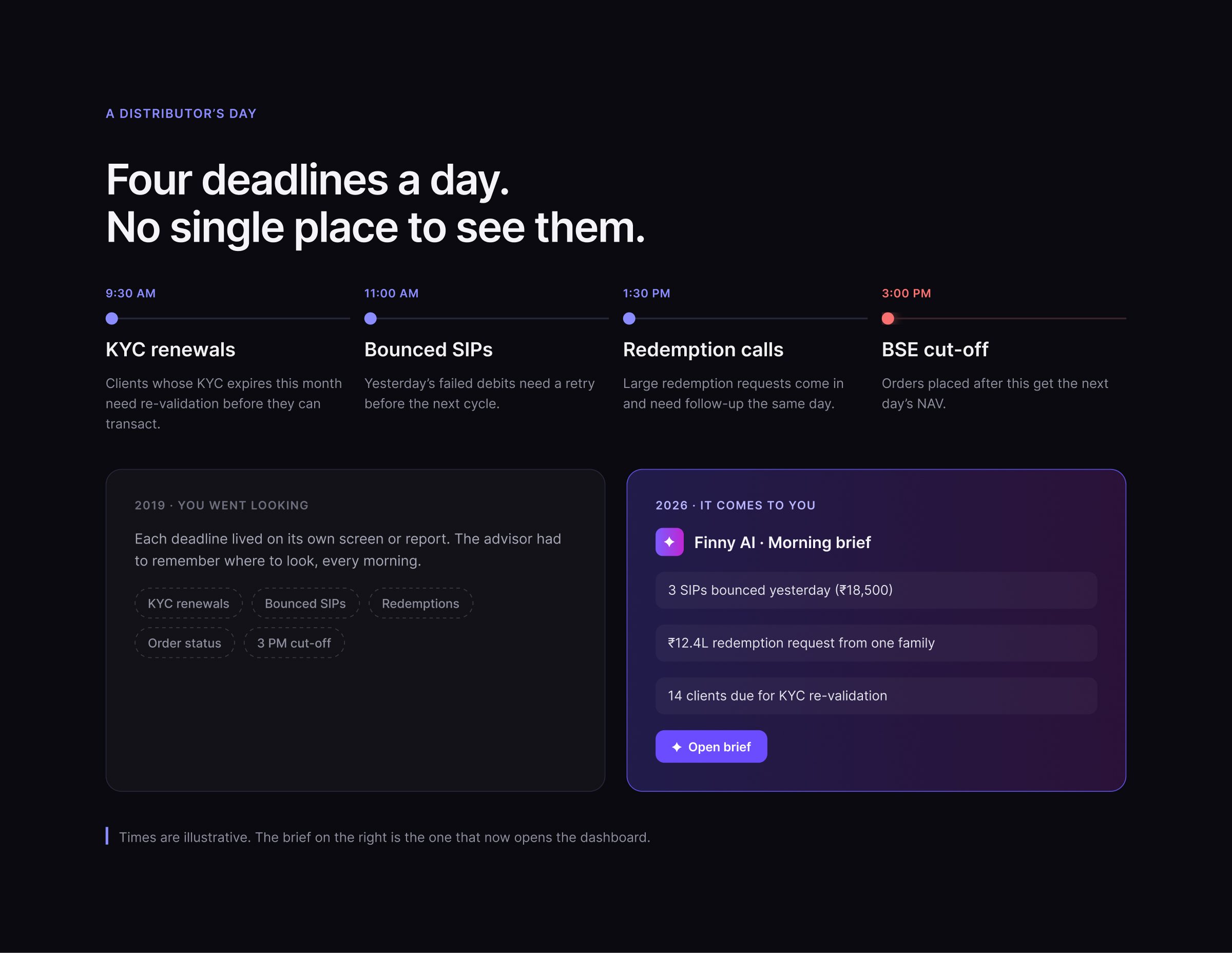
A distributor’s day runs on deadlines: BSE’s 3 PM cut-off, SIPs that bounce, KYC that expires. In the old product each of those lived somewhere different.
Click to zoom & inspect
FRAME 03 // 18A DISTRIBUTOR’S DAY
Four deadlines a day. No single place to see them.
Click to zoom & inspect
FRAME 04 // 18COMPETITOR RESEARCH
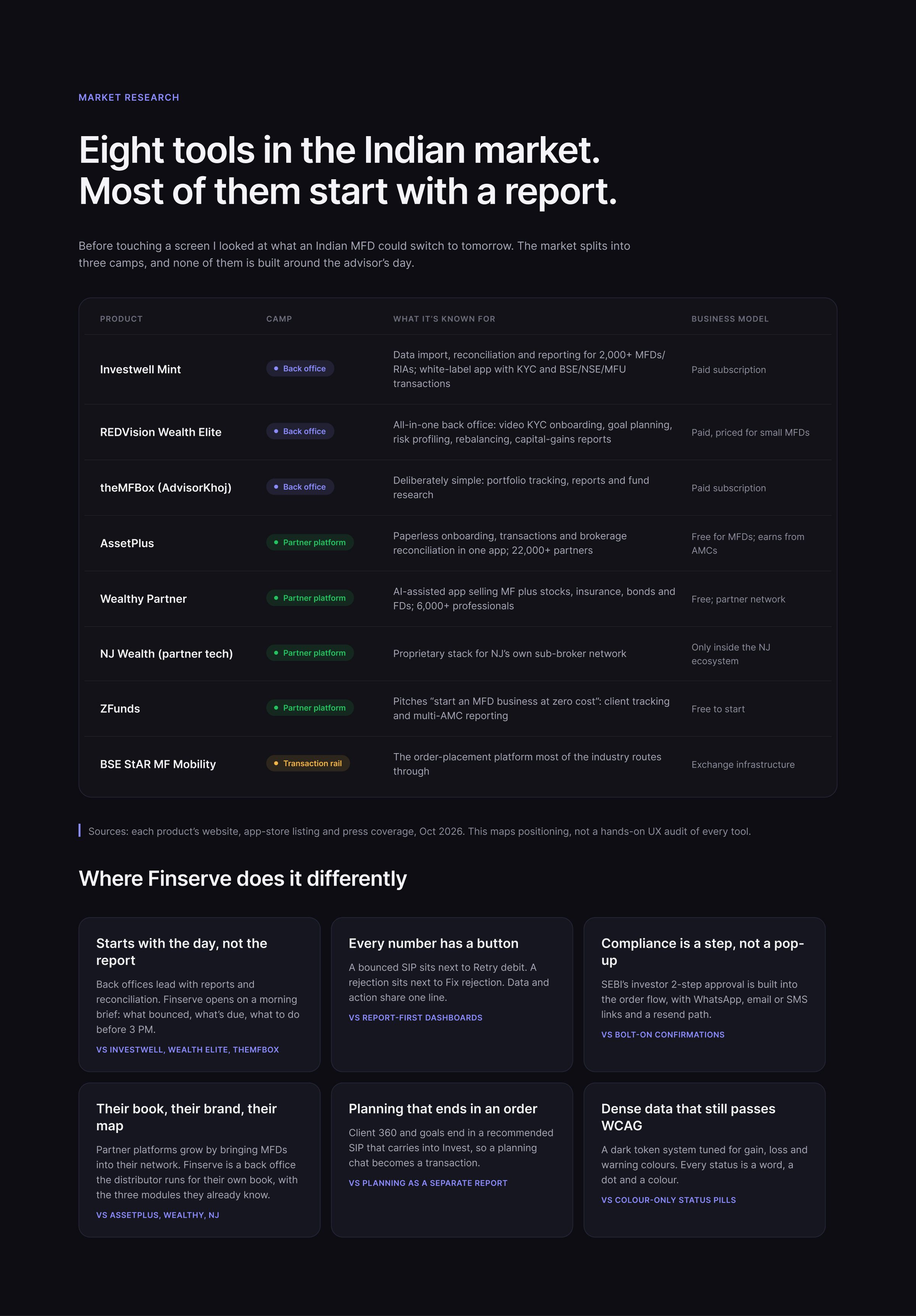
Eight tools in the Indian market. Most of them start with a report.
Where Finserve does it differently: it starts with the day, not the report, and every number has a button.
Click to zoom & inspect
CHAPTER 03
Process & decisions
FRAMES 05–09
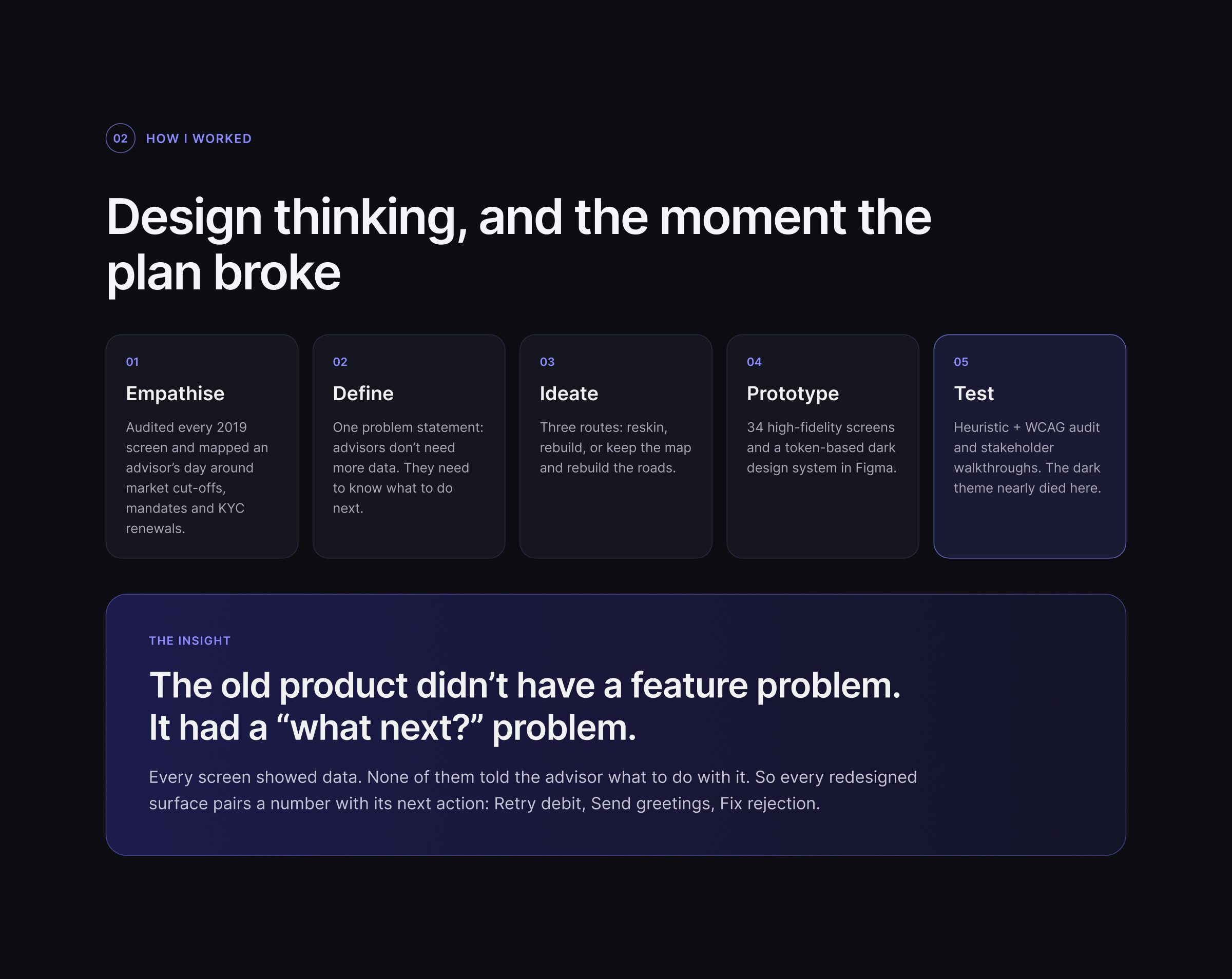
FRAME 05 // 18PROCESS
Design thinking, and the moment the plan broke
The old product didn’t have a feature problem. It had a “what next?” problem.
Click to zoom & inspect
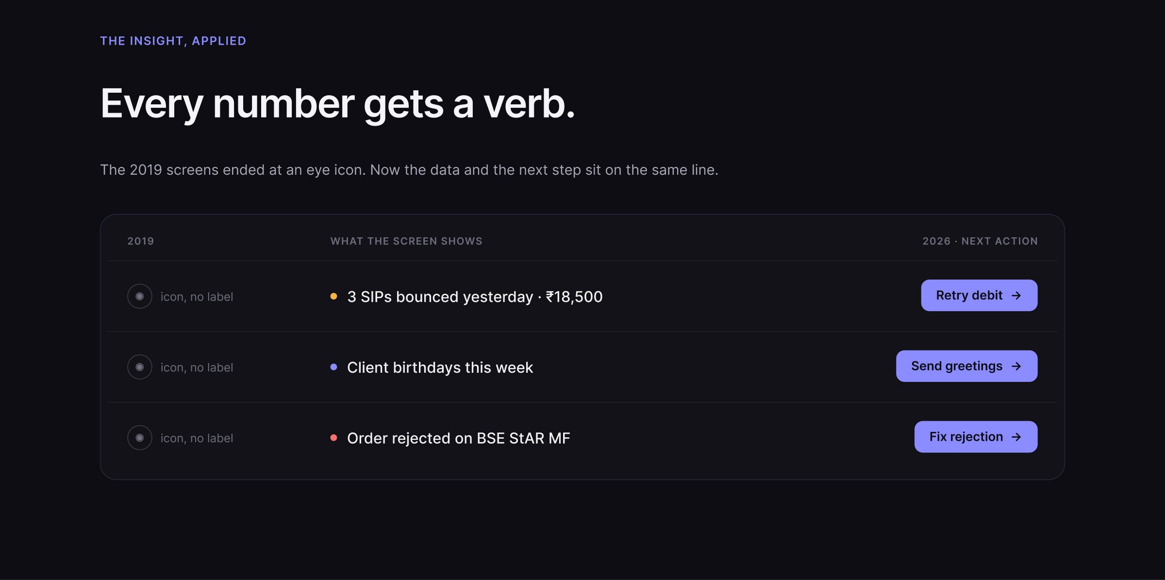
FRAME 06 // 18NUMBER → NEXT ACTION
Every number gets a verb.
Click to zoom & inspect
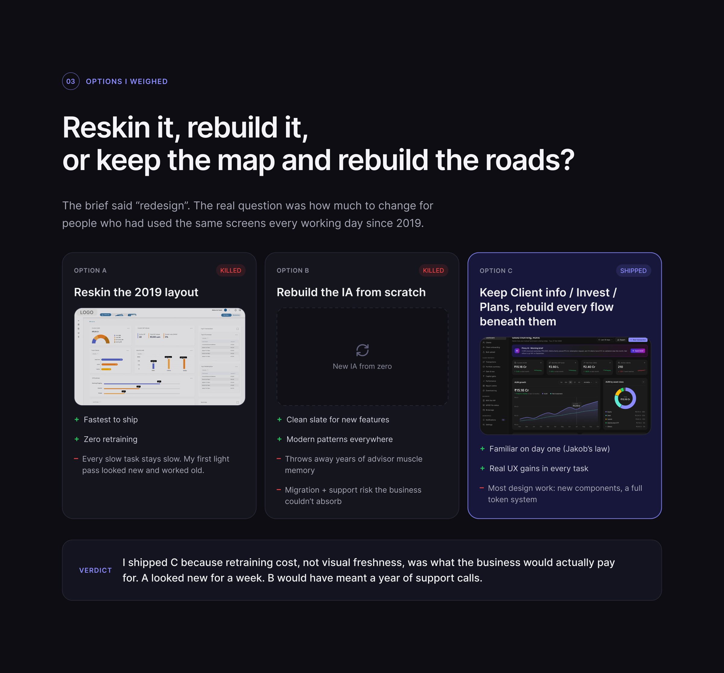
FRAME 07 // 18FORKS
Reskin it, rebuild it, or keep the map and rebuild the roads?
Three options weighed: reskin the 2019 layout, rebuild the IA from scratch, or keep Client info / Invest / Plans and rebuild every flow beneath them.
Click to zoom & inspect
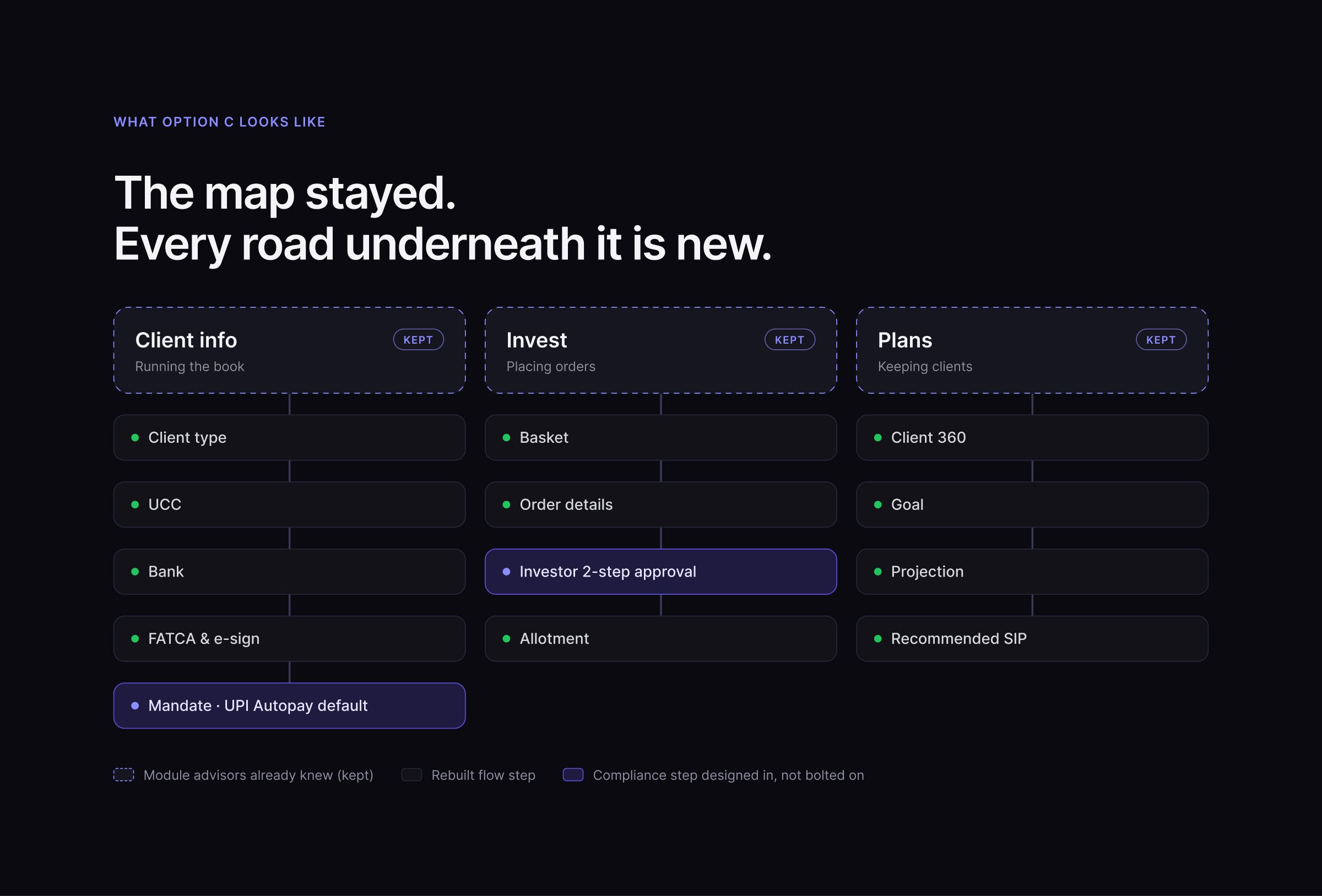
FRAME 08 // 18KEPT THE MAP, REBUILT THE ROADS
The map stayed. Every road underneath it is new.
Click to zoom & inspect
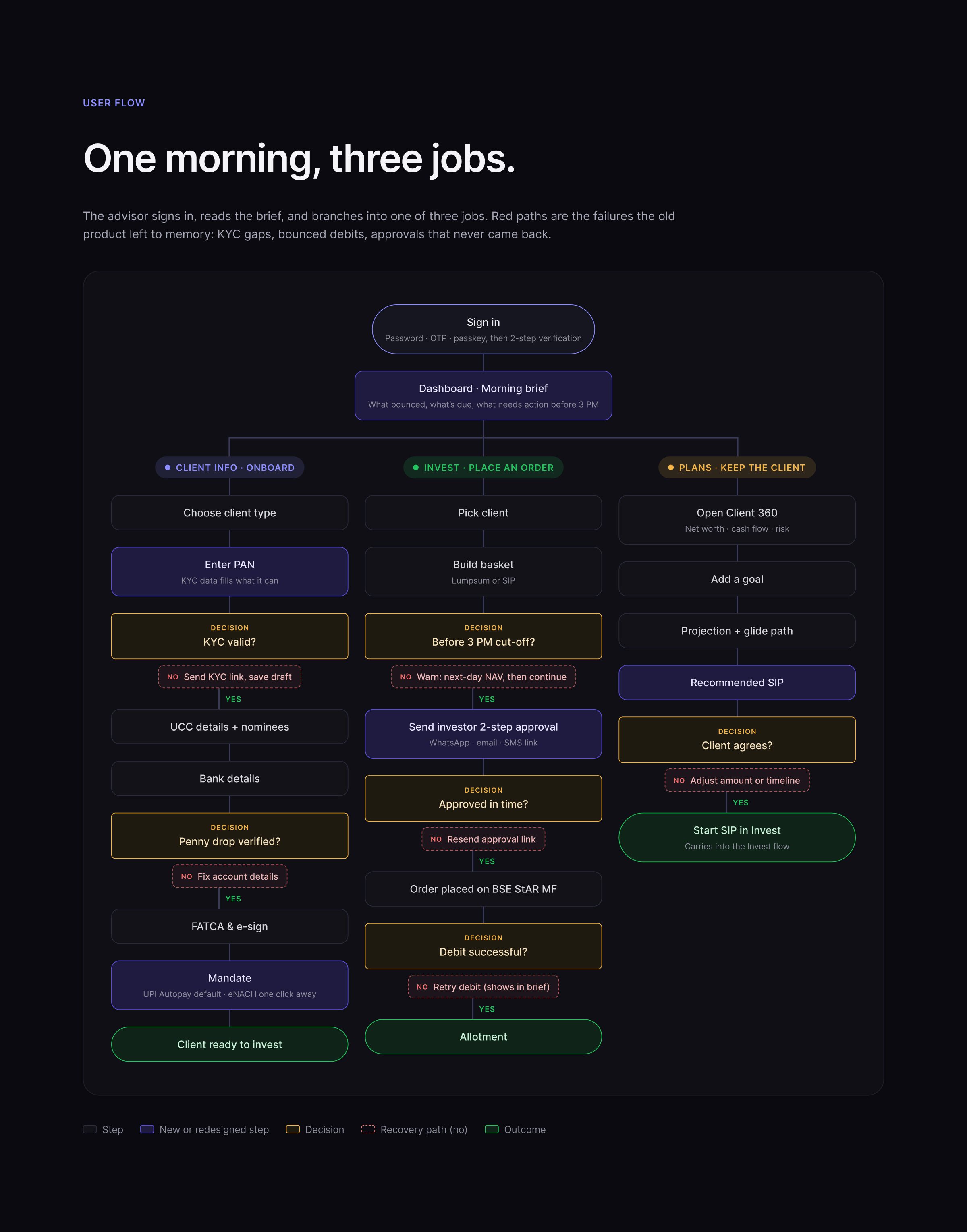
FRAME 09 // 18USER FLOW
One morning, three jobs.
The advisor signs in, reads the brief, and branches into one of three jobs. Red paths are the failures the old product left to memory.
Click to zoom & inspect
CHAPTER 04
Before / after
FRAMES 10–13
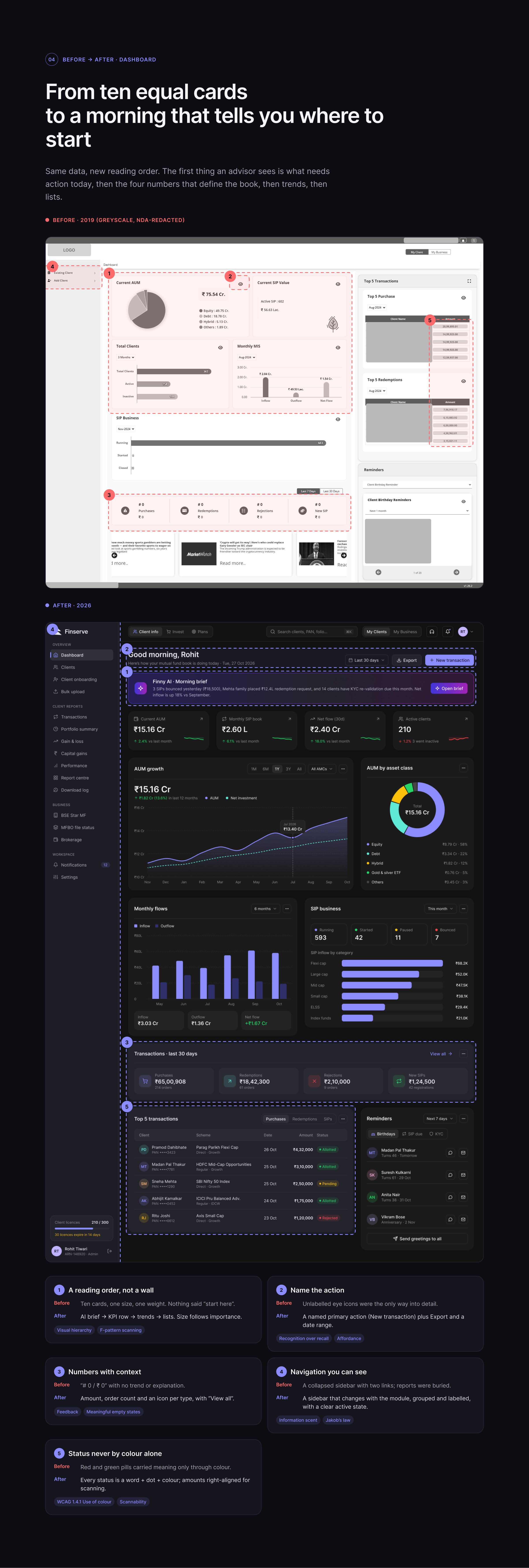
FRAME 10 // 18BEFORE / AFTER: DASHBOARD
From ten equal cards to a morning that tells you where to start
Same data, new reading order: what needs action today, then the four numbers that define the book, then trends, then lists.
Click to zoom & inspect
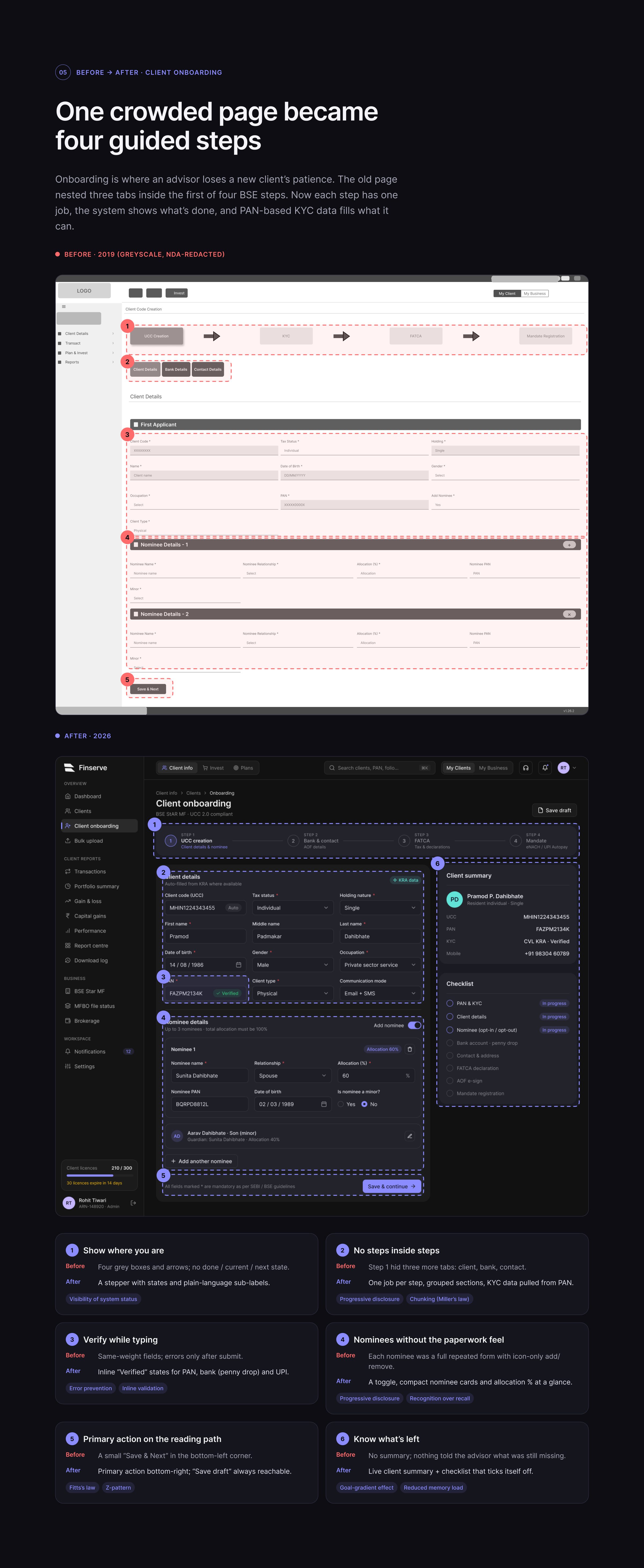
FRAME 11 // 18BEFORE / AFTER: ONBOARDING
One crowded page became four guided steps
The old page nested three tabs inside the first of four BSE steps. Now each step has one job.
Click to zoom & inspect
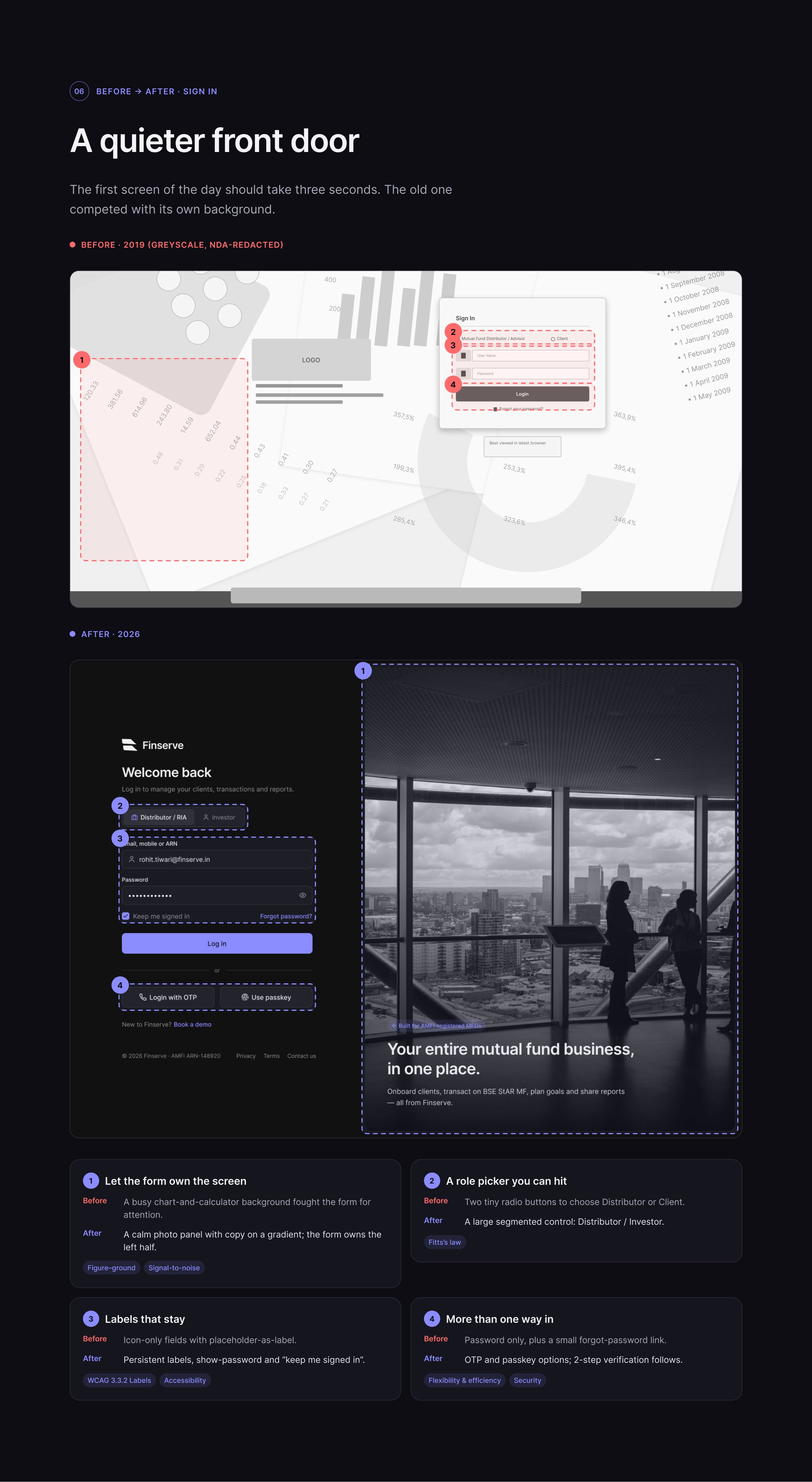
FRAME 12 // 18BEFORE / AFTER: LOGIN
A quieter front door
The first screen of the day should take three seconds. The old one competed with its own background.
Click to zoom & inspect
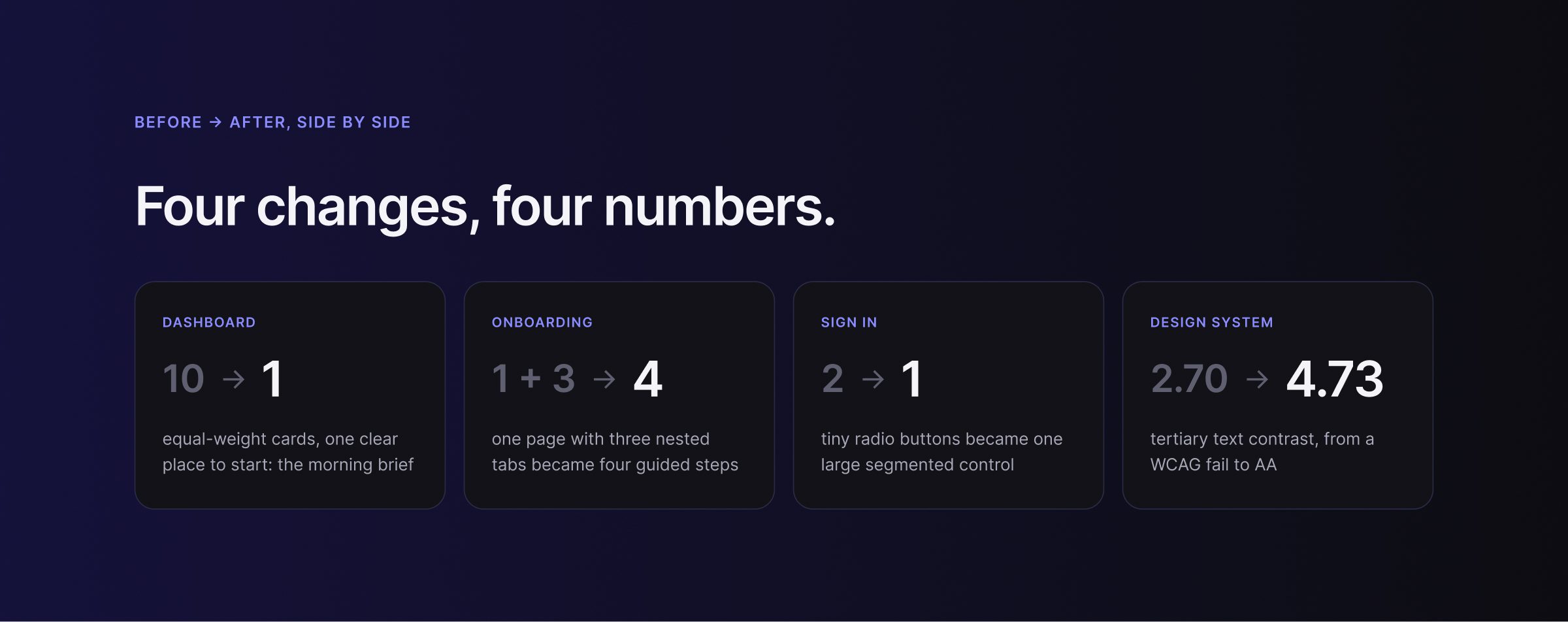
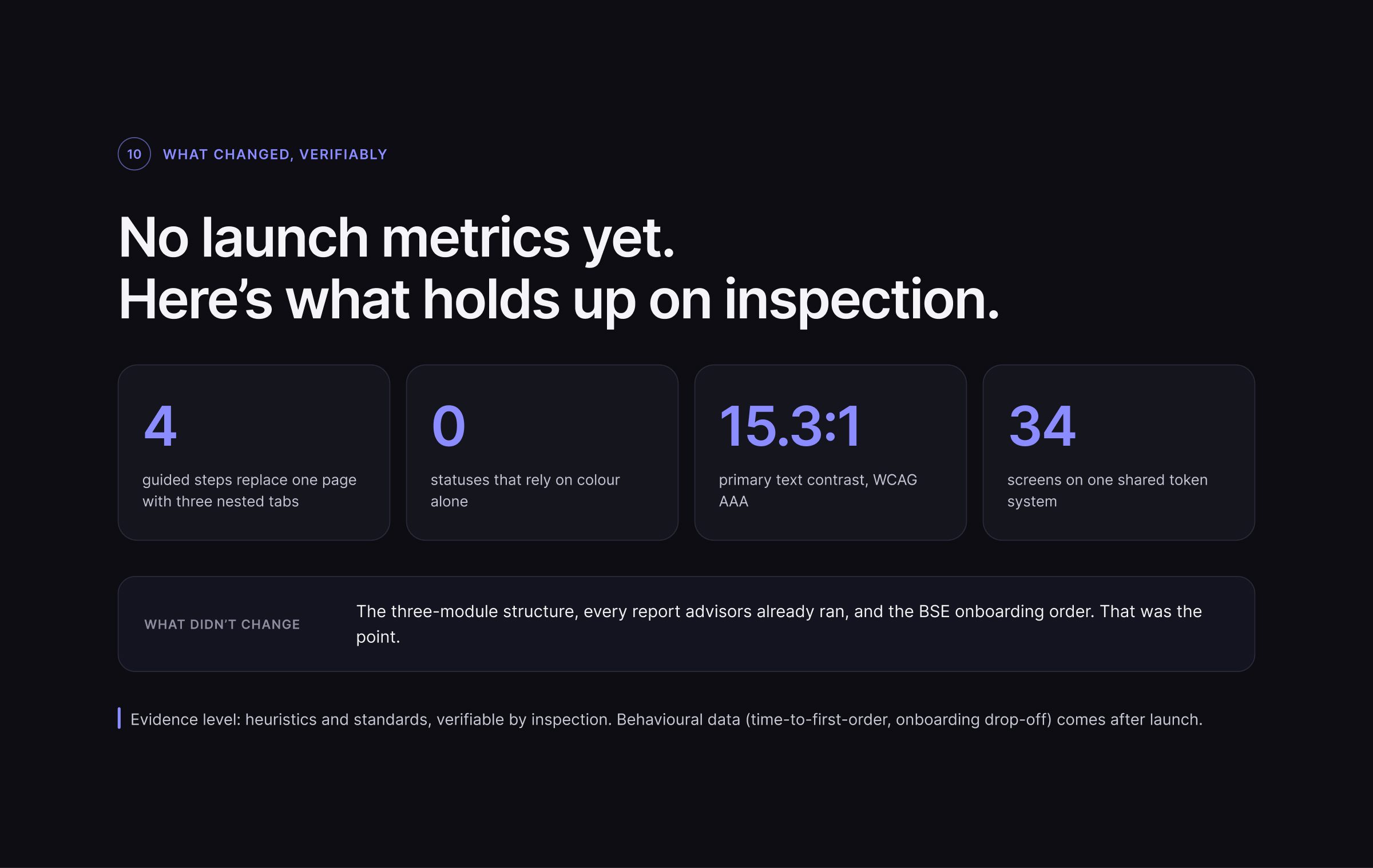
FRAME 13 // 18BEFORE → AFTER IN NUMBERS
Four changes, four numbers.
Click to zoom & inspect
CHAPTER 05
Craft & system
FRAMES 14–16
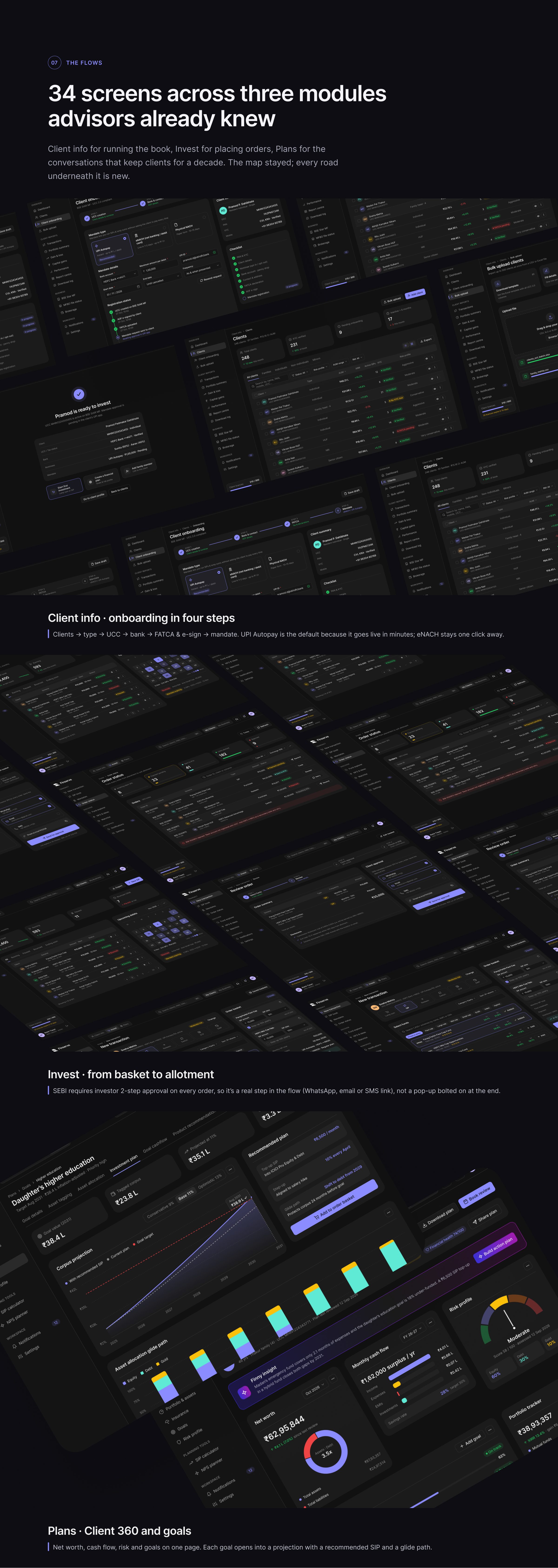
FRAME 14 // 18CRAFT: FLOWS
34 screens across three modules advisors already knew
Client info, onboarding in four steps · Invest, from basket to allotment · Plans, Client 360 and goals.
Click to zoom & inspect
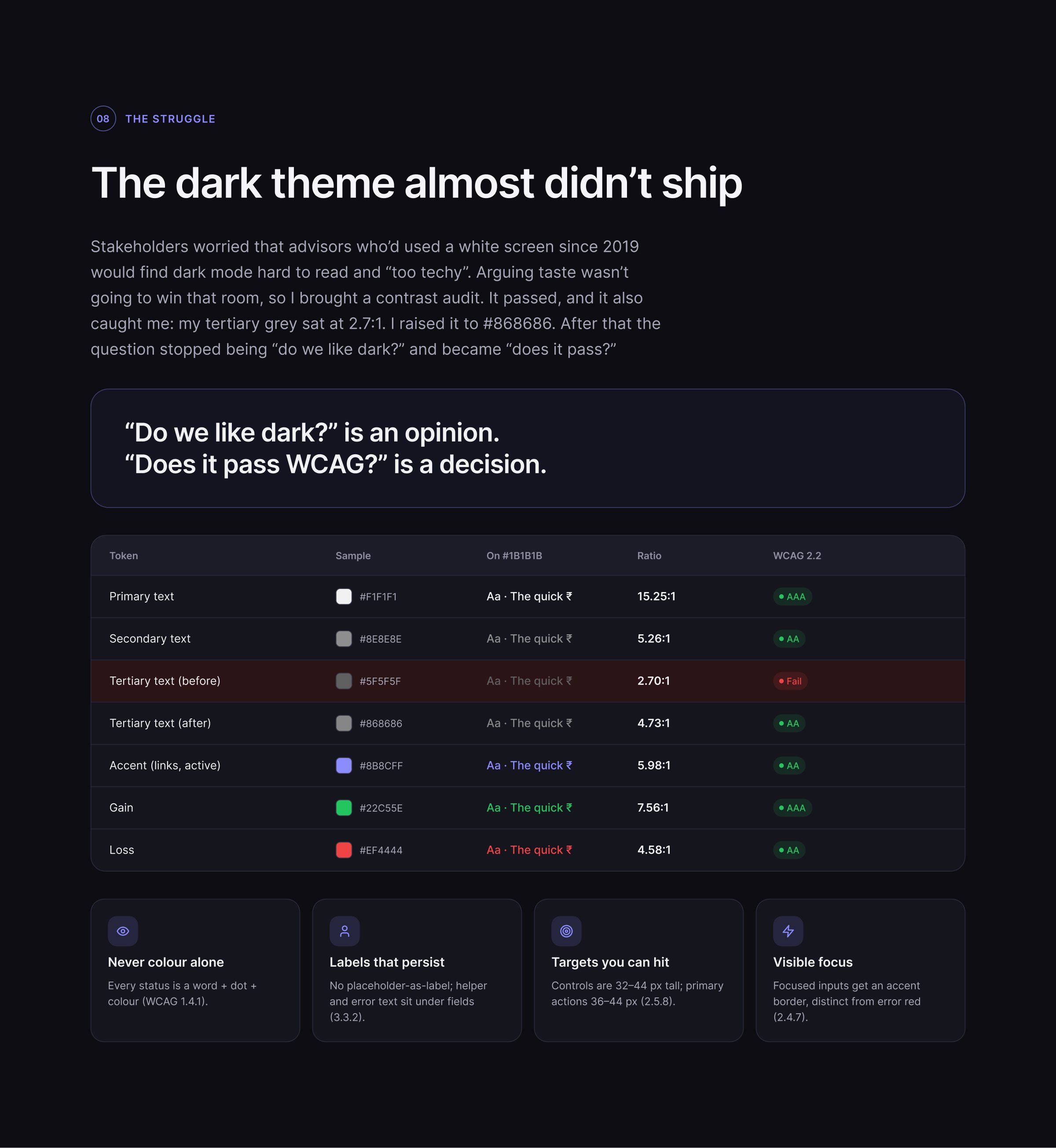
FRAME 15 // 18STRUGGLE & ACCESSIBILITY
The dark theme almost didn’t ship
“Do we like dark?” is an opinion. “Does it pass WCAG?” is a decision.
Click to zoom & inspect
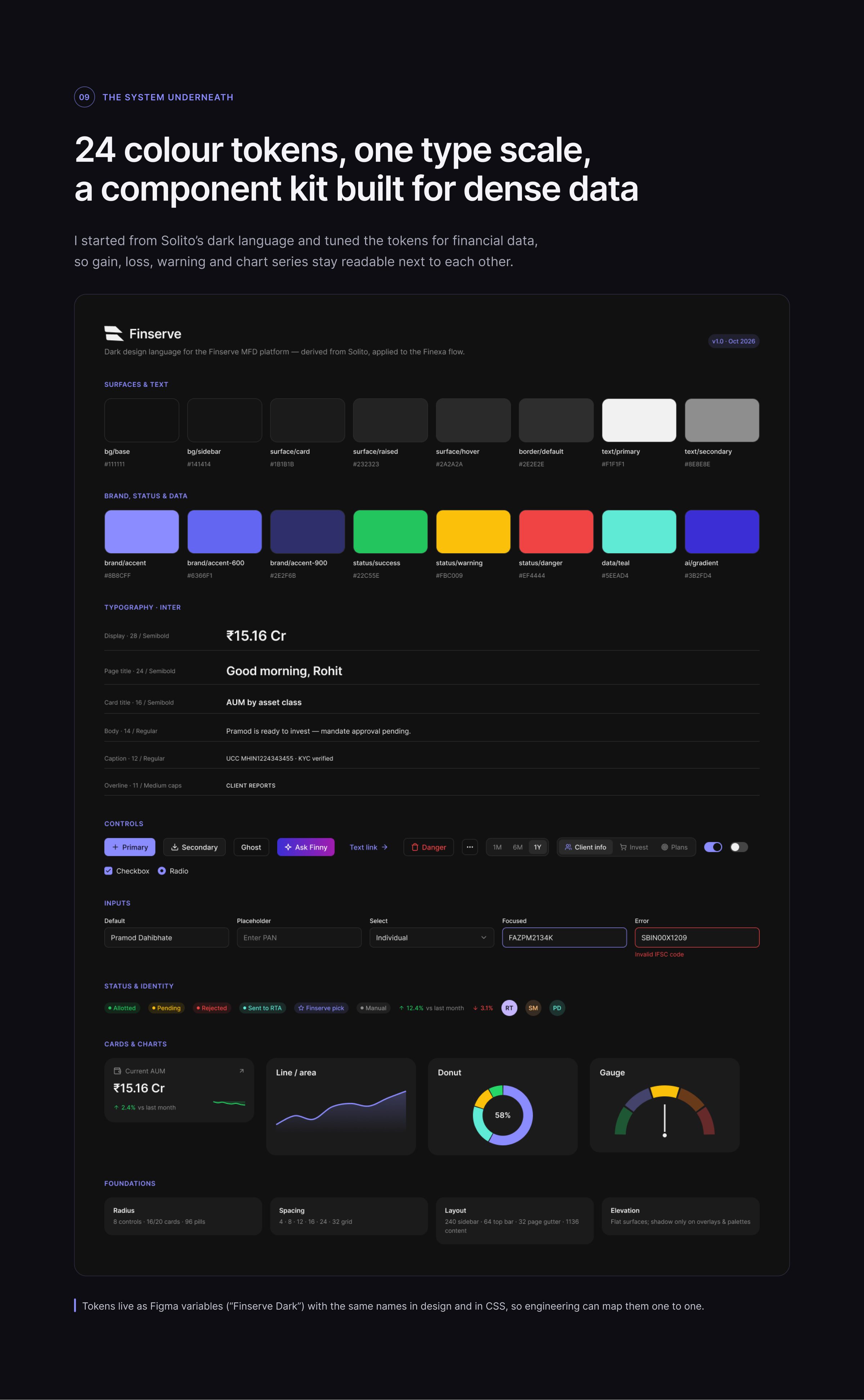
FRAME 16 // 18DESIGN SYSTEM
24 colour tokens, one type scale, a component kit built for dense data
Tokens live as Figma variables with the same names in design and in CSS, so engineering can map them one to one.
Click to zoom & inspect
CHAPTER 06
Proof & reflection
FRAMES 17–18
FRAME 17 // 18PROOF
No launch metrics yet. Here’s what holds up on inspection.
Click to zoom & inspect
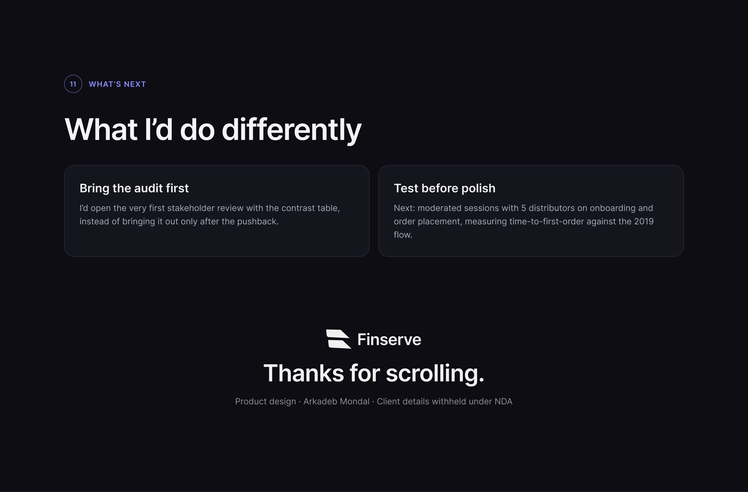
FRAME 18 // 18AFTER
What I’d do differently
Bring the audit first. Thanks for scrolling.
Click to zoom & inspect
FRAME 01 // INTROFINSERVE — Same three tabs. A completely different afternoon.