> BRAND_IDENTITY + PRODUCT_DESIGN // CASE_STUDY // FITNEX // 22_FRAMES

FITNEX — One brand.
One system.

Design thinking, run on two tracks. Part 01 builds a strength-first fitness brand that feels premium, disciplined and full of energy. Part 02 designs the gym management system that runs behind it, so owners, managers and trainers can see what needs attention without learning another complicated tool.

[ DISCIPLINE ]
Brand Identity · Product Design · UI/UX
[ TRACKS ]
Fitness brand · Gym management system (B2B SaaS)
[ SCOPE ]
Brand guidelines · 40 screens · Desktop & tablet
[ PROCESS ]
Empathize · Define · Ideate · Prototype · Test
Case Study Format: 22 frames in 6 chapters. Click any frame to inspect it in full resolution.
Start reading
CHAPTER 01

Intro

FRAME 01
FRAME 01 // 22 INTRO

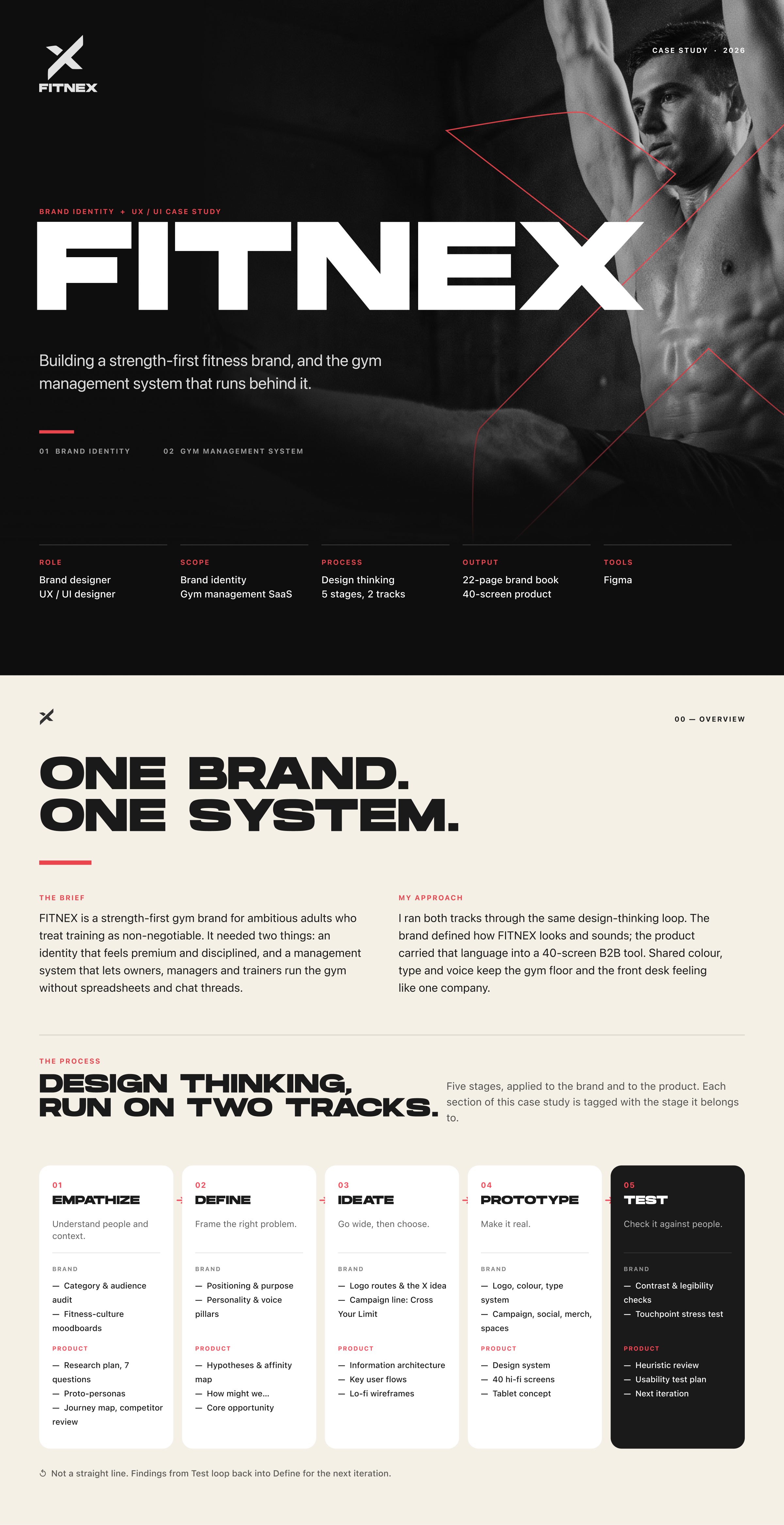
FITNEX — One brand. One system.

Design thinking, run on two tracks: building a strength-first fitness brand, and the gym management system that runs behind it.

Fitnex intro: one brand and one system, with the design thinking process run on two tracks.
Click to zoom & inspect
CHAPTER 02

Part 01 — Brand: research

FRAMES 02–05
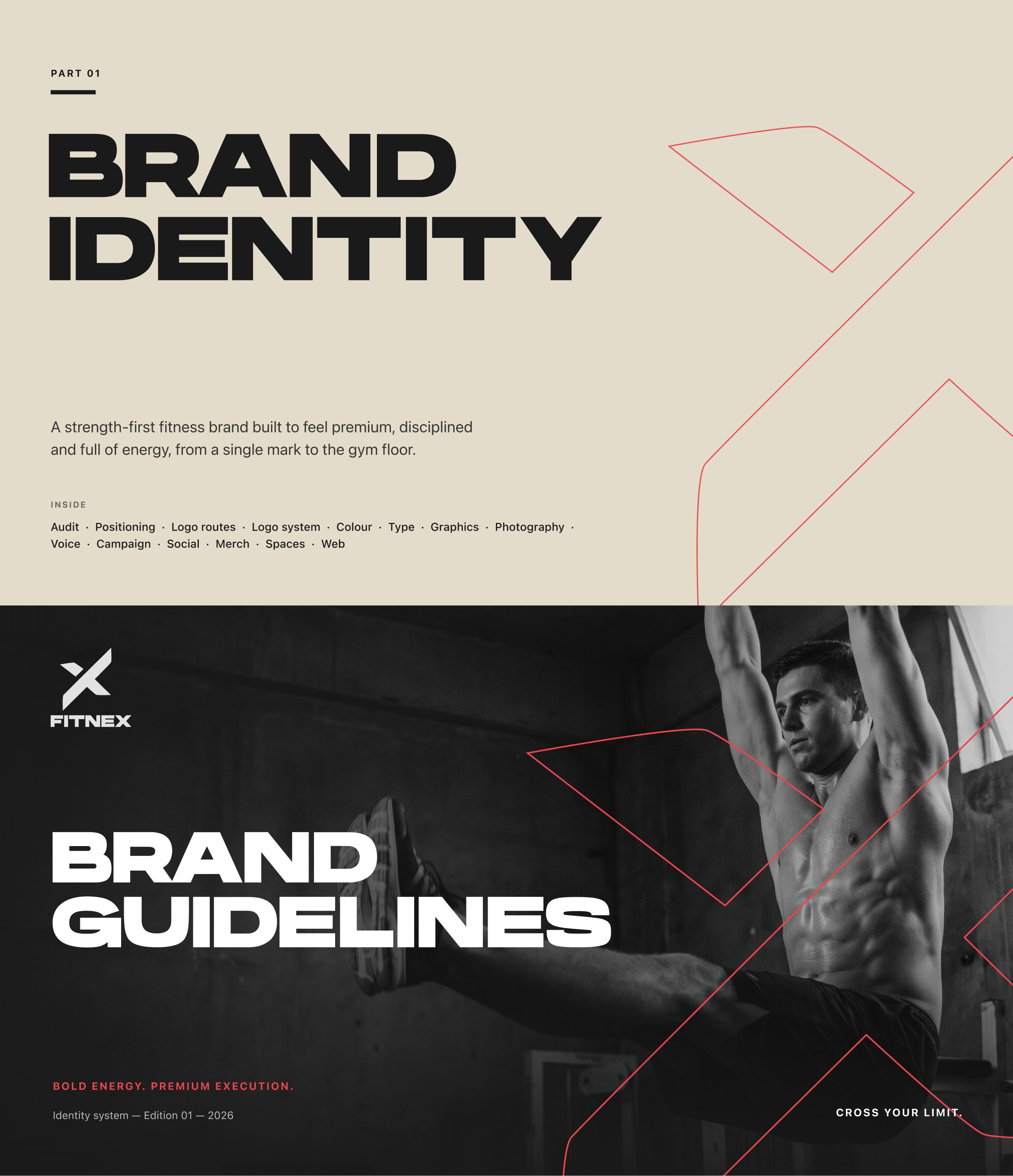
FRAME 02 // 22 PART 01 — BRAND

Brand identity & guidelines

A strength-first fitness brand built to feel premium, disciplined and full of energy, from a single mark to the gym floor.

Part 01 cover: Fitnex brand identity and brand guidelines.
Click to zoom & inspect
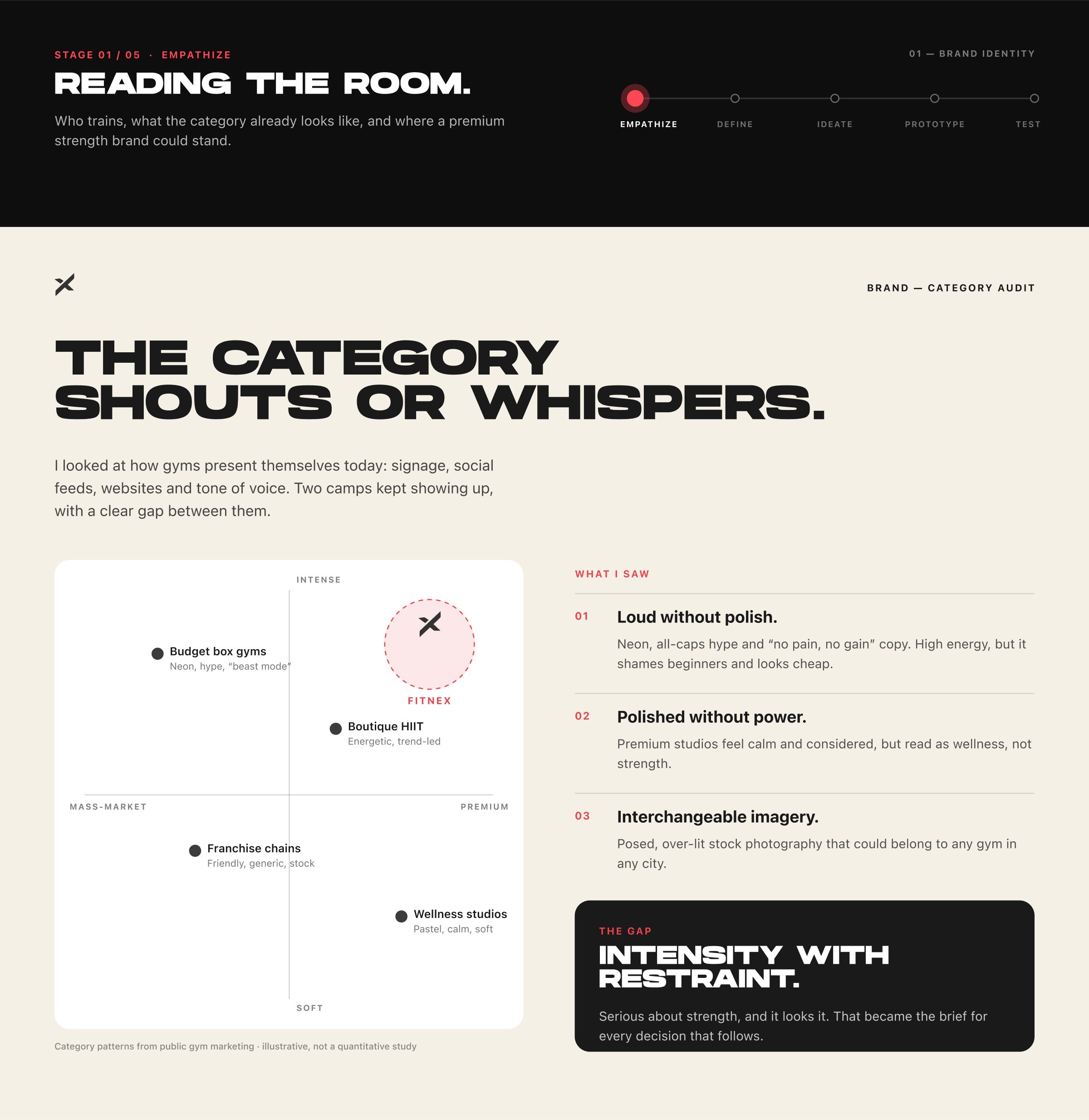
FRAME 03 // 22 BRAND — EMPATHIZE

The category shouts or whispers.

Who trains, what the category already looks like, and where a premium strength brand could stand.

Brand empathize: audit of how gyms present themselves, split between loud and polished camps.
Click to zoom & inspect
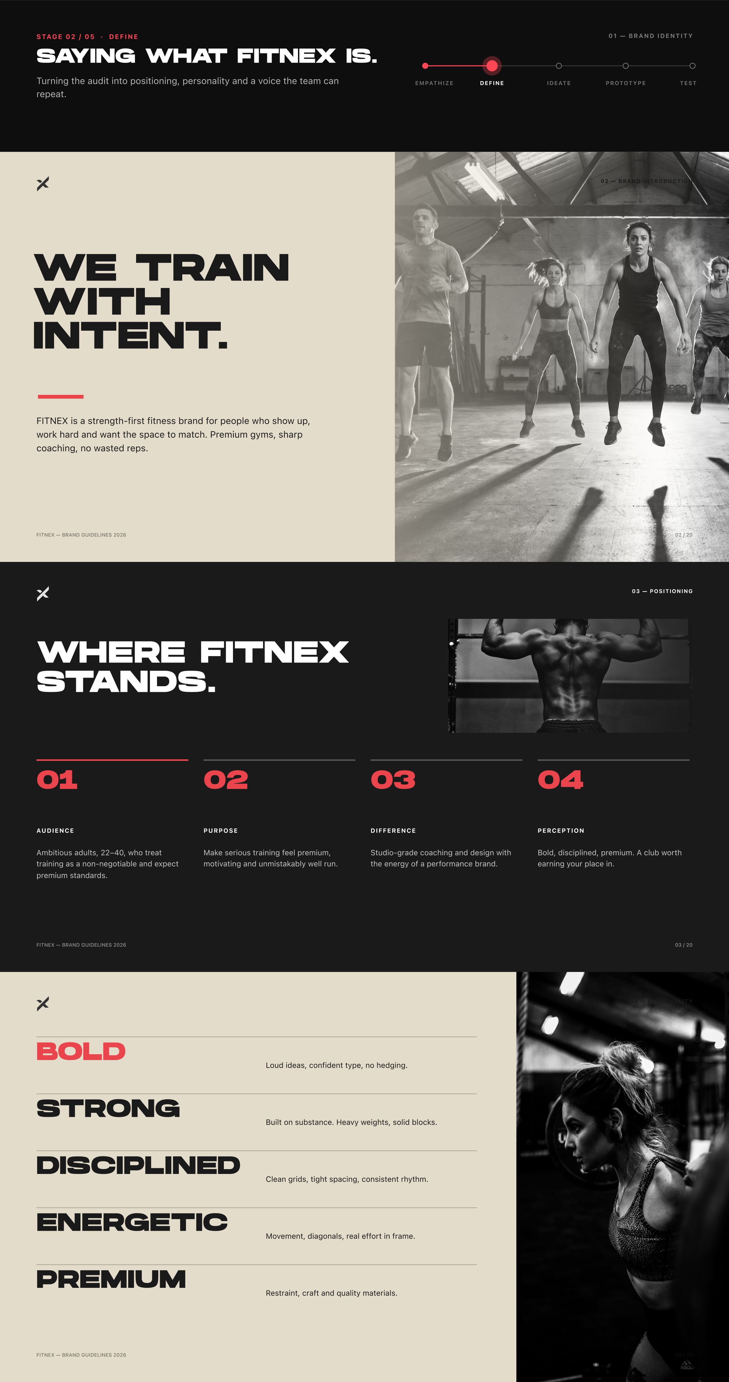
FRAME 04 // 22 BRAND — DEFINE

We train with intent.

Where Fitnex stands: bold, strong, disciplined.

Brand define: positioning and the brand attributes bold, strong and disciplined.
Click to zoom & inspect
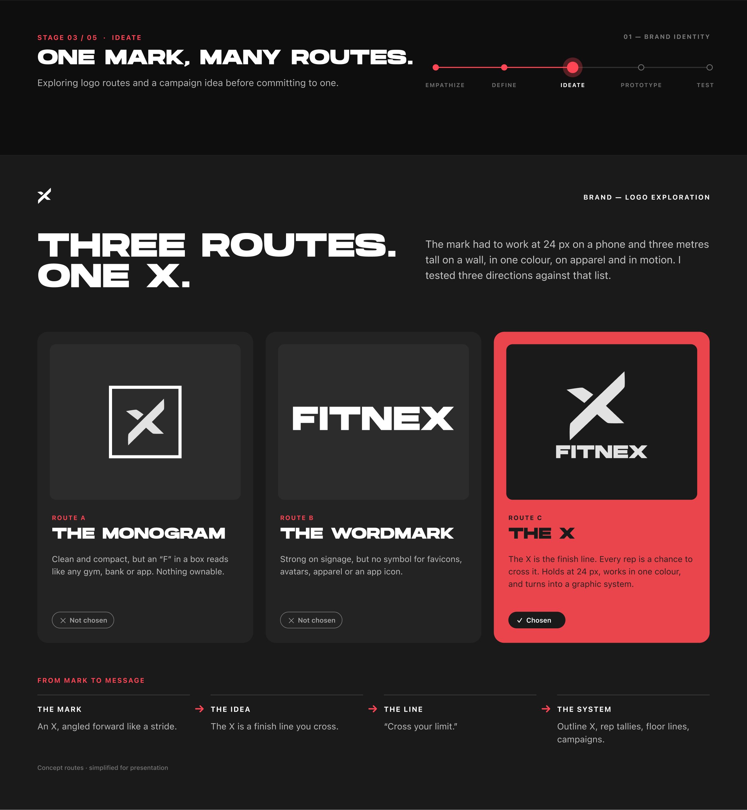
FRAME 05 // 22 BRAND — IDEATE

Three routes. One X.

Exploring logo routes and a campaign idea before committing to one. The X is the finish line: every rep is a chance to cross it.

Brand ideate: three logo routes, the monogram, the wordmark and the X.
Click to zoom & inspect
CHAPTER 03

Part 01 — Brand: identity

FRAMES 06–10
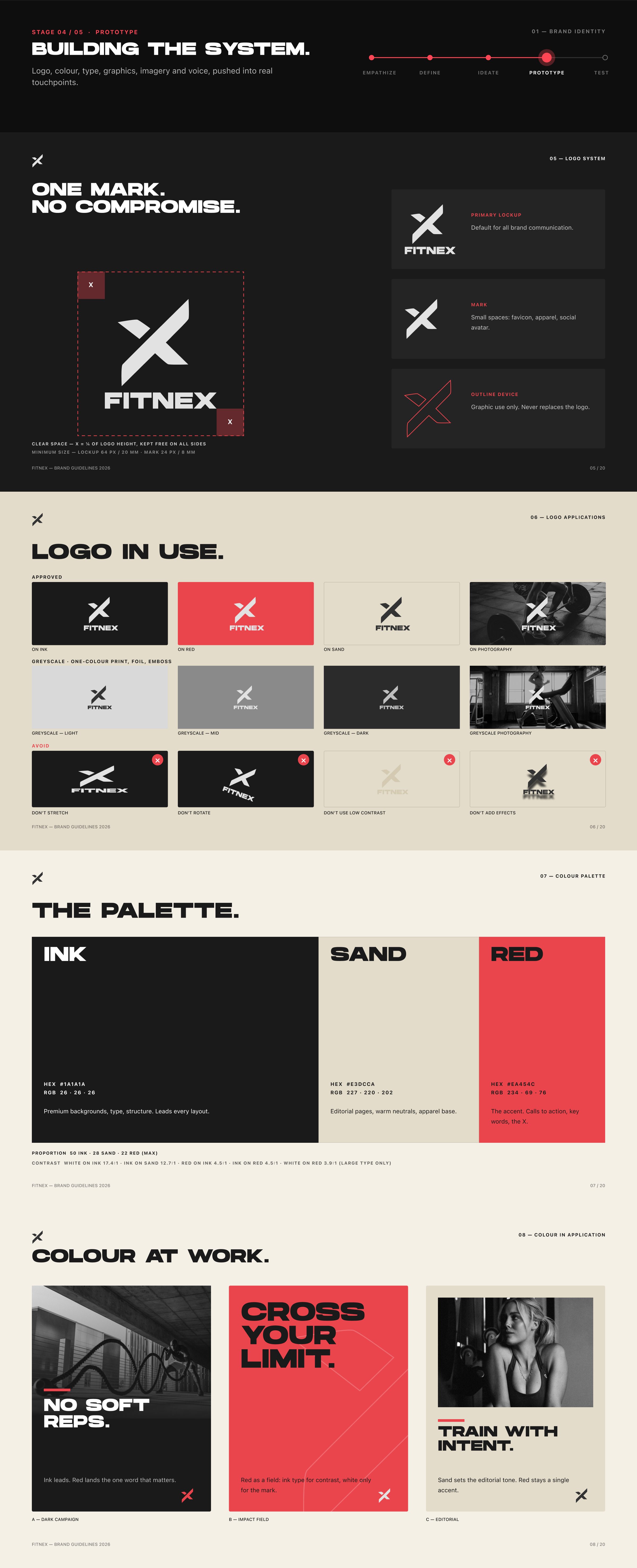
FRAME 06 // 22 BRAND — PROTOTYPE: LOGO & COLOUR

Cross your limit.

The logo in use, the palette, and colour at work.

Brand prototype: the Fitnex logo in use and the colour palette.
Click to zoom & inspect
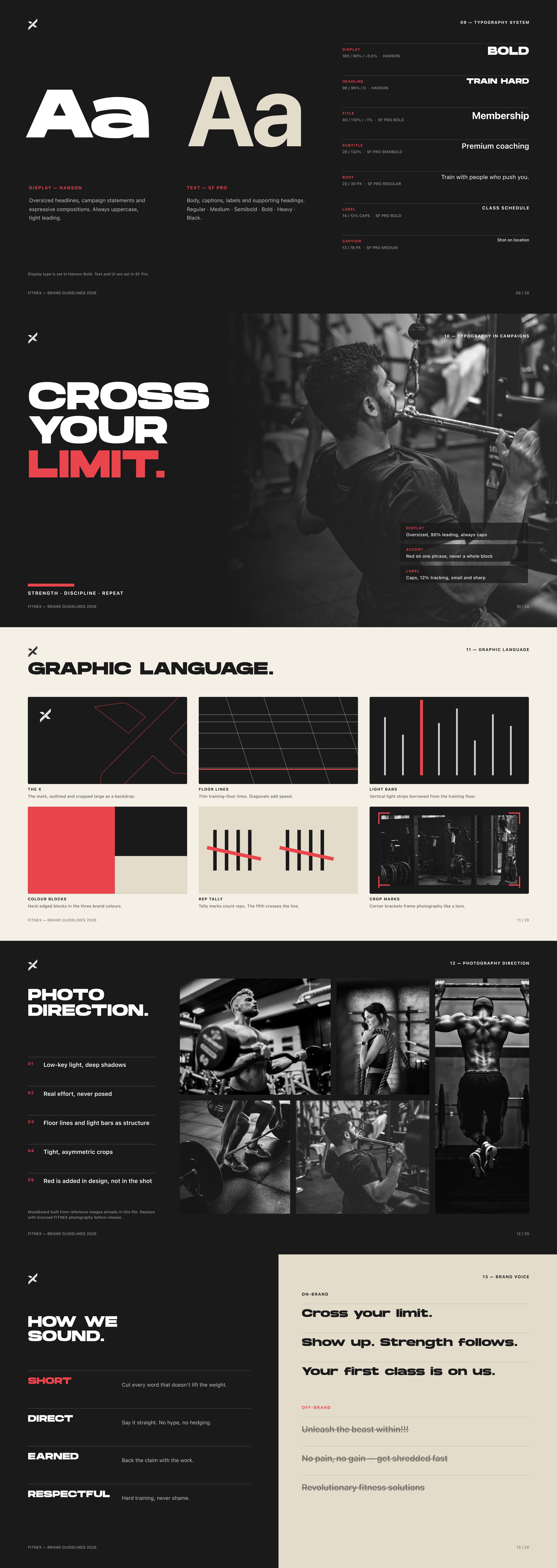
FRAME 07 // 22 BRAND — PROTOTYPE: TYPE, GRAPHICS, VOICE

Graphic language, photo direction, and how we sound.

Brand prototype: typography, graphic language, photo direction and tone of voice.
Click to zoom & inspect
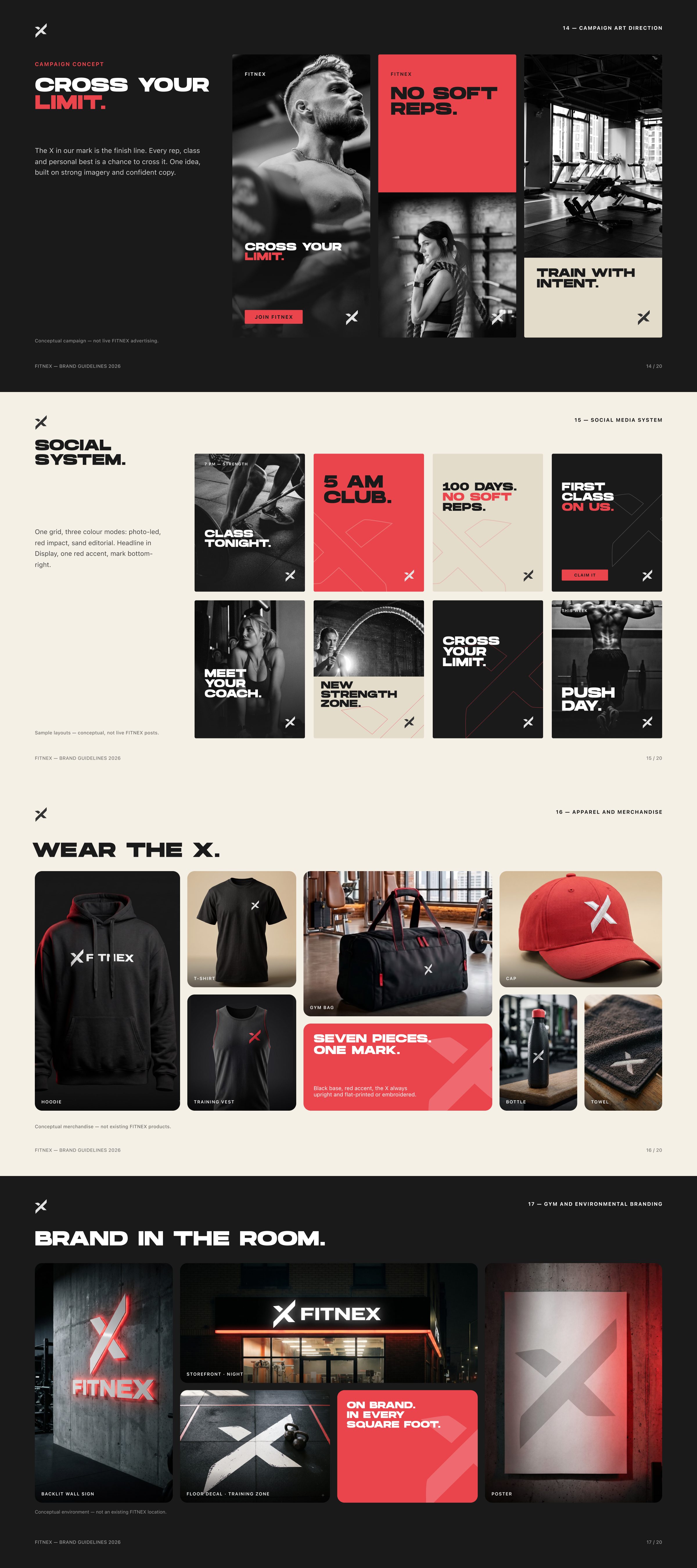
FRAME 08 // 22 BRAND — PROTOTYPE: APPLICATIONS

Wear the X. Brand in the room.

Brand applications: merchandise, gym spaces and campaign lines such as No soft reps and 5 AM Club.
Click to zoom & inspect
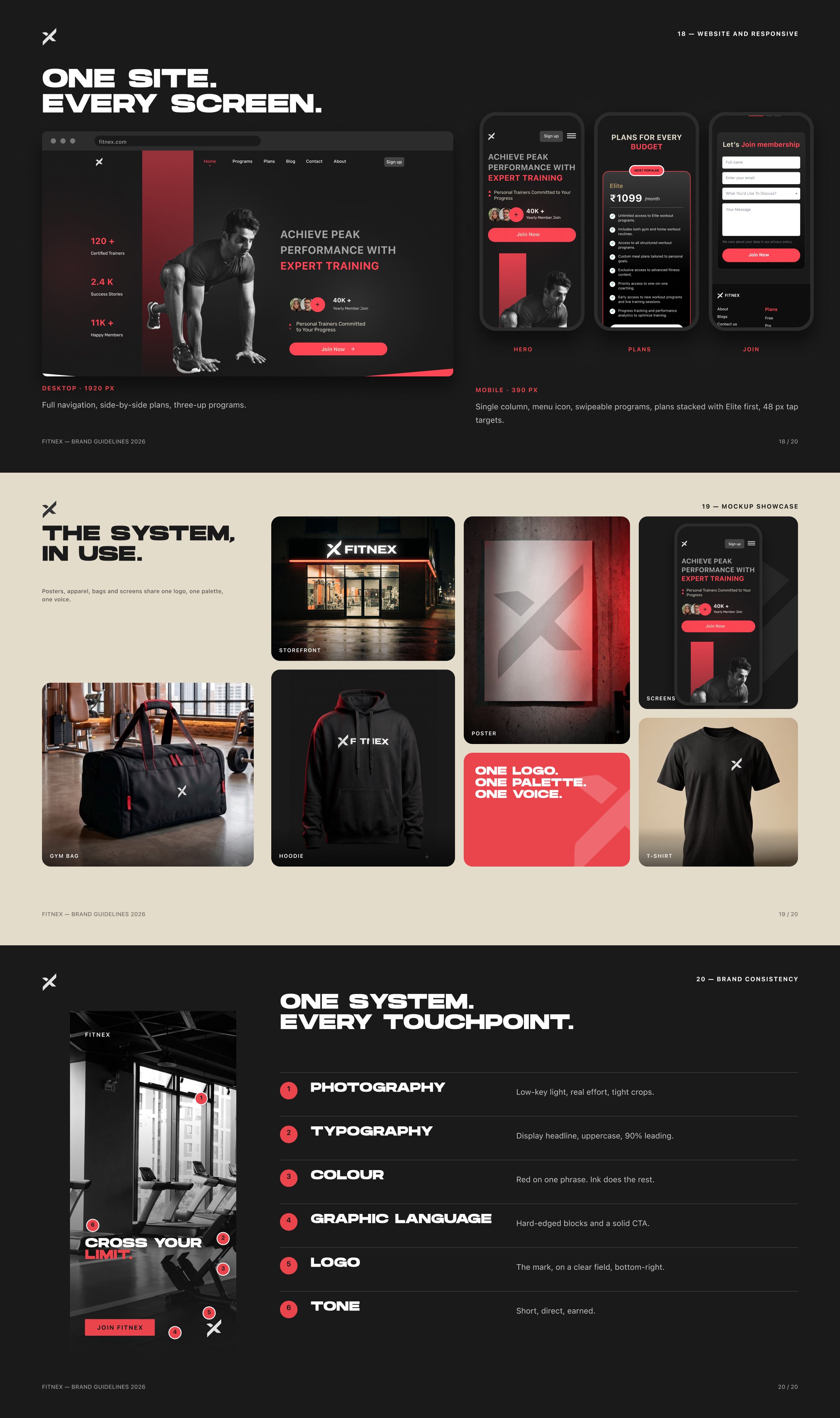
FRAME 09 // 22 BRAND — PROTOTYPE: DIGITAL & CONSISTENCY

One site. Every screen.

One logo. One palette. One voice. One system, every touchpoint.

Brand on the website and across touchpoints.
Click to zoom & inspect
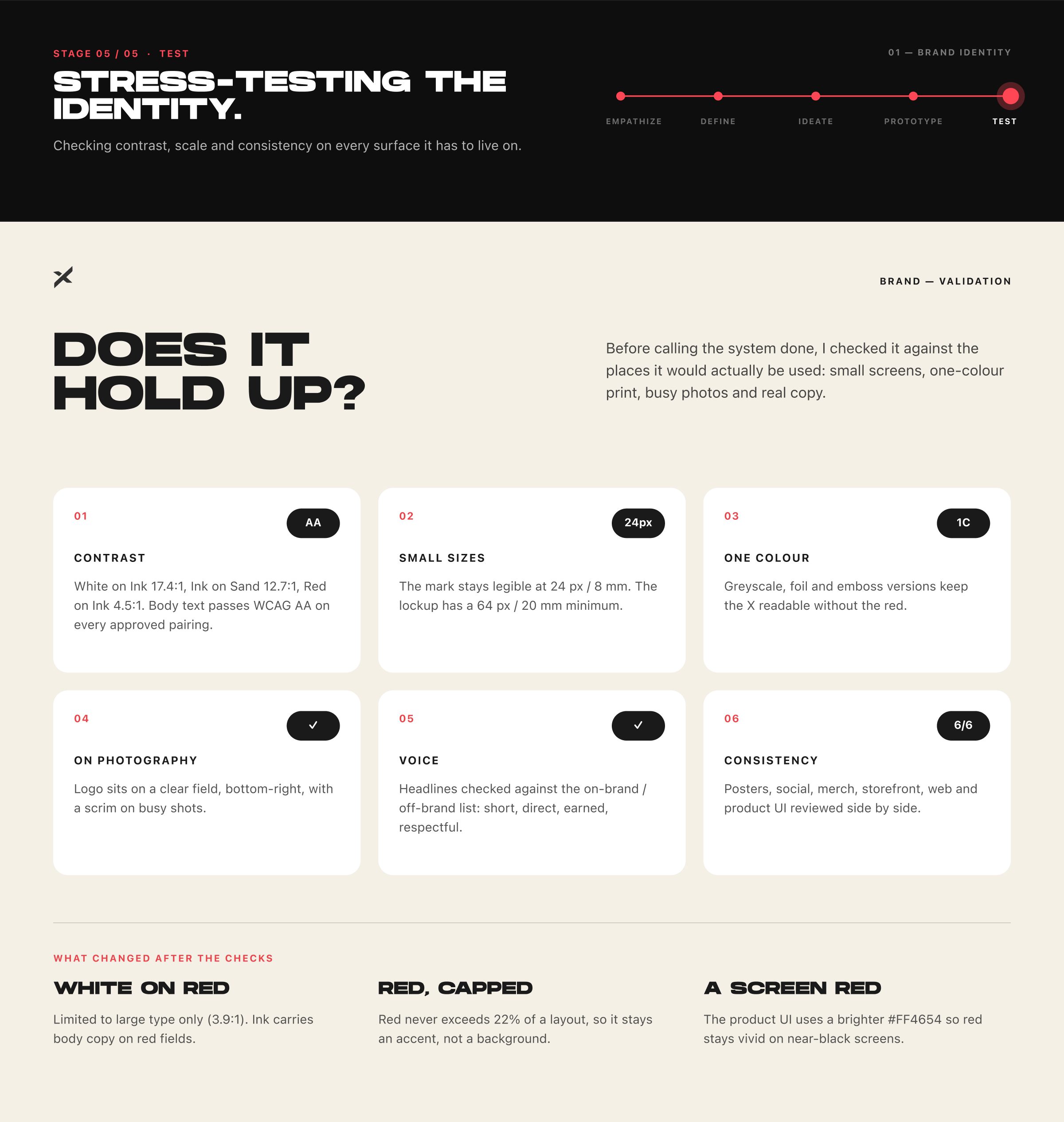
FRAME 10 // 22 BRAND — TEST

Does it hold up?

Checking contrast, scale and consistency on every surface it has to live on. Body text passes WCAG AA on every approved pairing.

Brand test: contrast ratios and minimum sizes for the identity.
Click to zoom & inspect
CHAPTER 04

Part 02 — Gym system: research

FRAMES 11–15
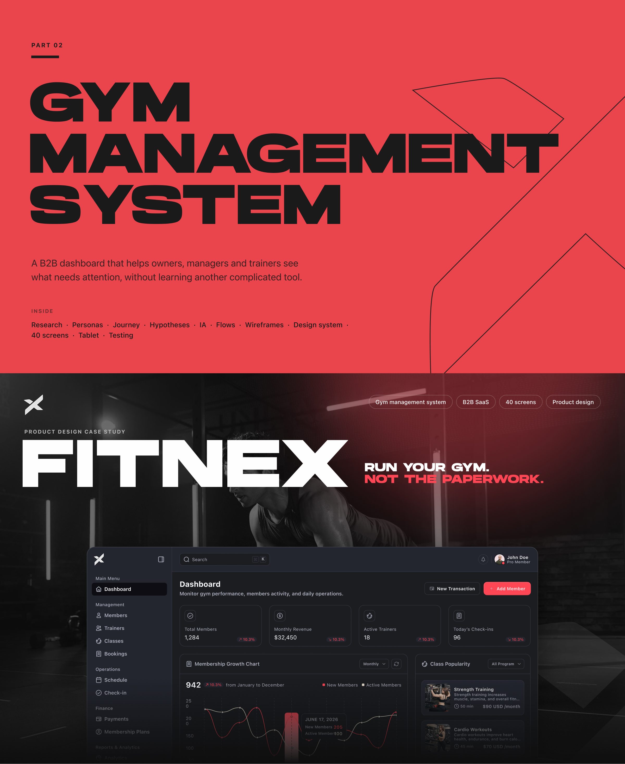
FRAME 11 // 22 PART 02 — GYM SYSTEM

Gym management system

A B2B dashboard that helps owners, managers and trainers see what needs attention, without learning another complicated tool.

Part 02 cover: the Fitnex gym management system dashboard.
Click to zoom & inspect
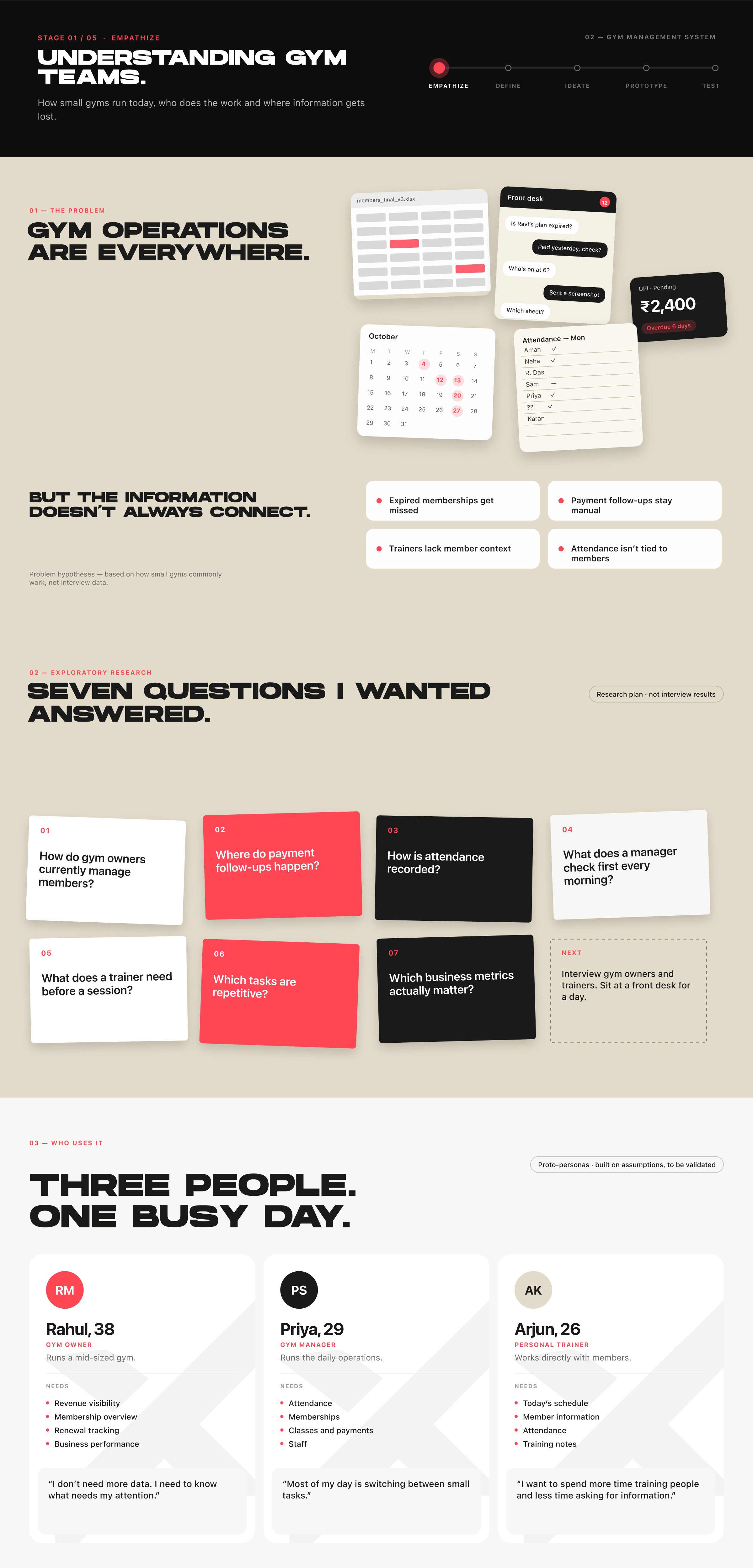
FRAME 12 // 22 PRODUCT — EMPATHIZE

Understanding gym teams.

Gym operations are everywhere. Seven questions I wanted answered, and three people with one busy day.

Product empathize: the problem, research questions and three personas.
Click to zoom & inspect
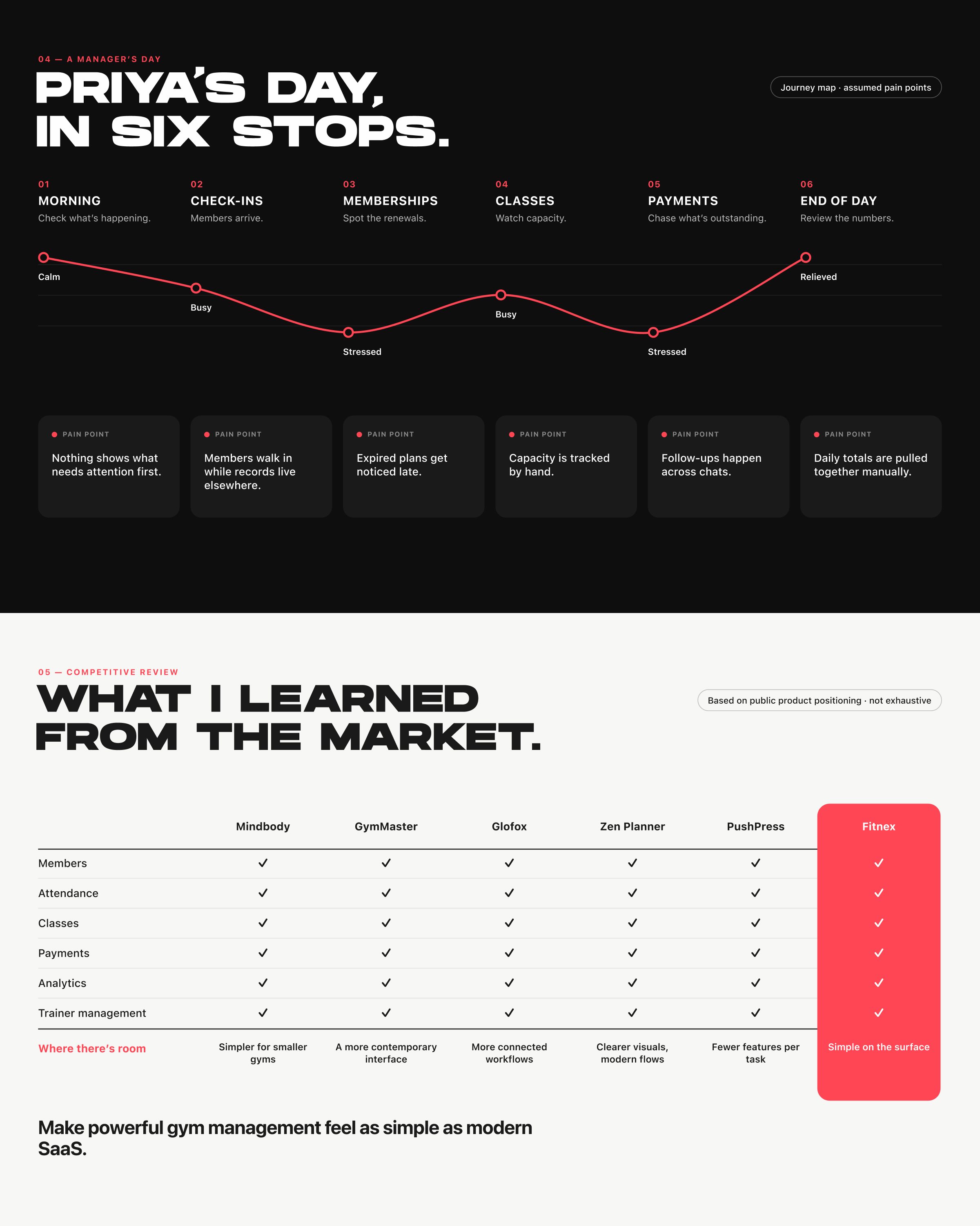
FRAME 13 // 22 PRODUCT — EMPATHIZE: JOURNEY & MARKET

Priya’s day, in six stops.

What I learned from the market: make powerful gym management feel as simple as modern SaaS.

Journey map of Priya’s day and a competitive review of gym software.
Click to zoom & inspect
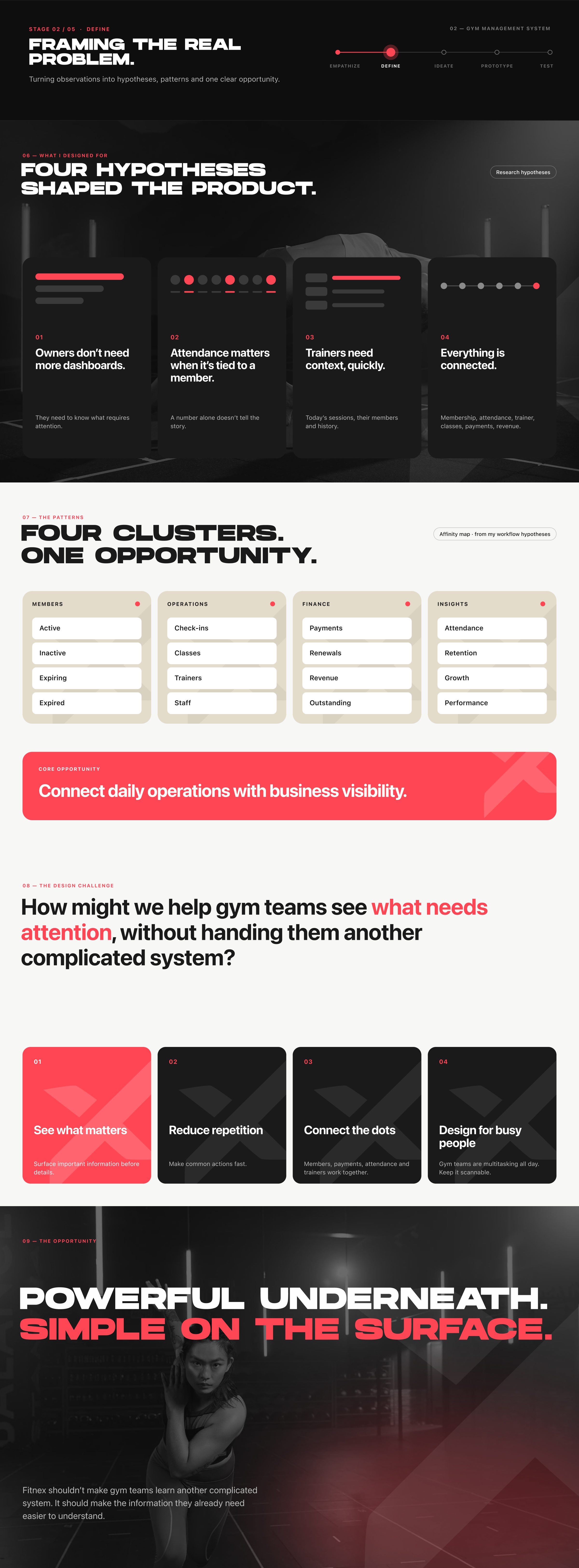
FRAME 14 // 22 PRODUCT — DEFINE

Powerful underneath. Simple on the surface.

How might we help gym teams see what needs attention, without handing them another complicated system?

Product define: four hypotheses, four clusters and the how-might-we statement.
Click to zoom & inspect
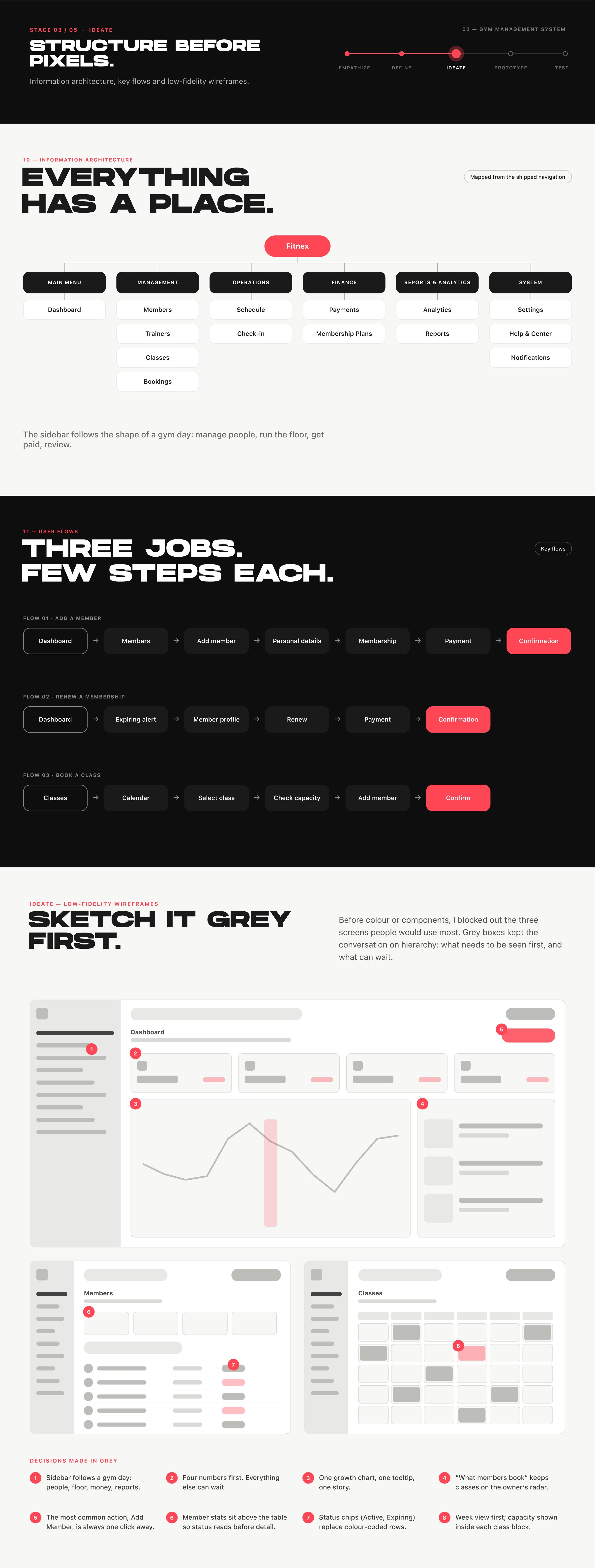
FRAME 15 // 22 PRODUCT — IDEATE

Structure before pixels.

Information architecture, key flows and low-fidelity wireframes. Grey boxes kept the conversation on hierarchy.

Product ideate: information architecture, three user flows and grey wireframes.
Click to zoom & inspect
CHAPTER 05

Part 02 — Gym system: screens

FRAMES 16–21
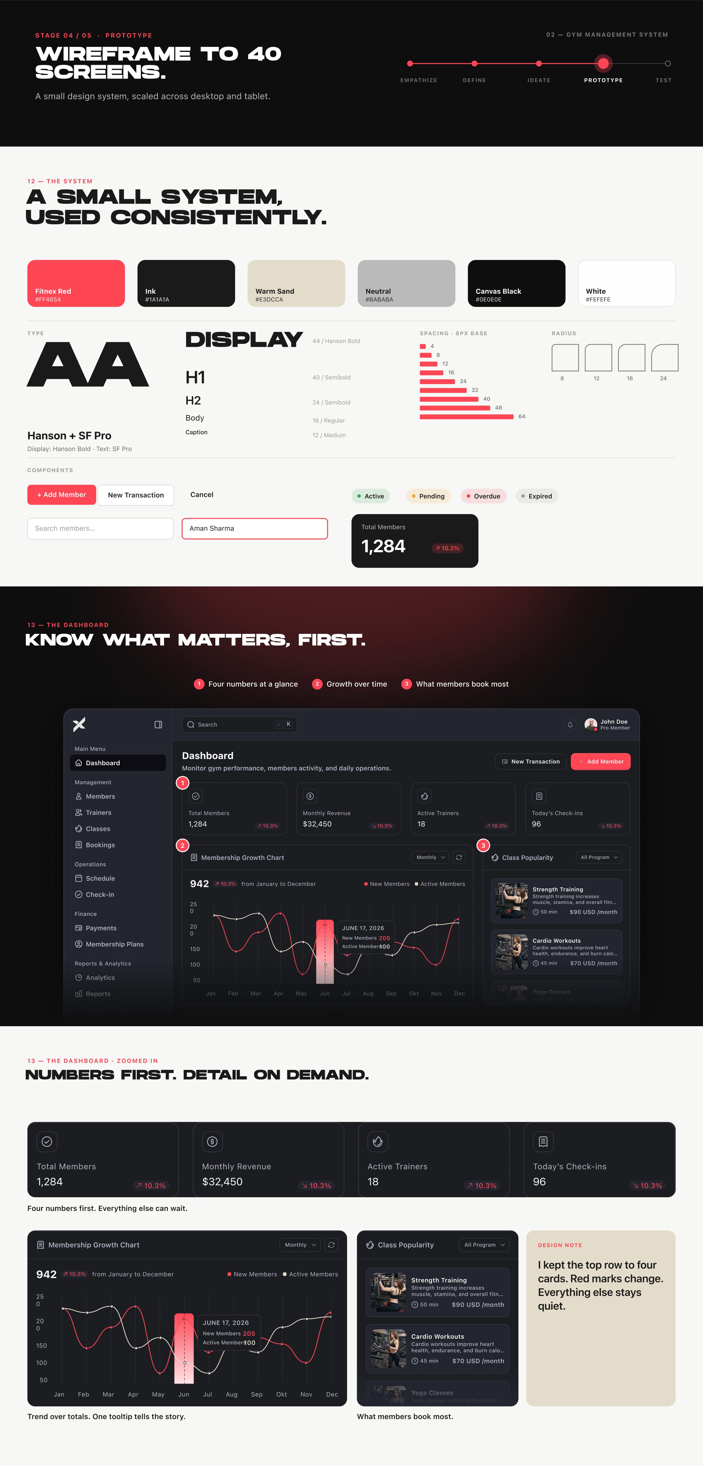
FRAME 16 // 22 PRODUCT — PROTOTYPE: SYSTEM & DASHBOARD

Wireframe to 40 screens.

A small design system, scaled across desktop and tablet. Know what matters, first.

Design system and the desktop dashboard.
Click to zoom & inspect
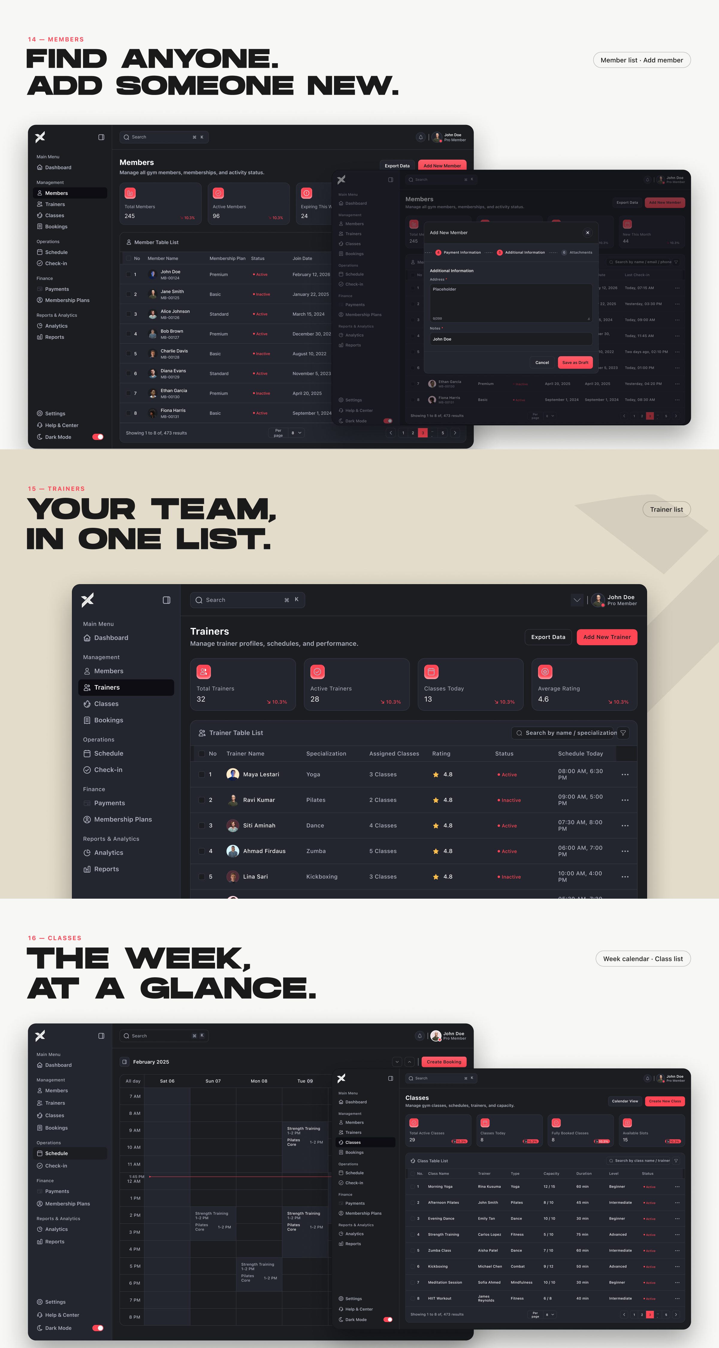
FRAME 17 // 22 PRODUCT — PROTOTYPE: PEOPLE & CLASSES

Find anyone. Your team, in one list. The week, at a glance.

Members, trainers and classes.

Members, trainers and classes screens.
Click to zoom & inspect
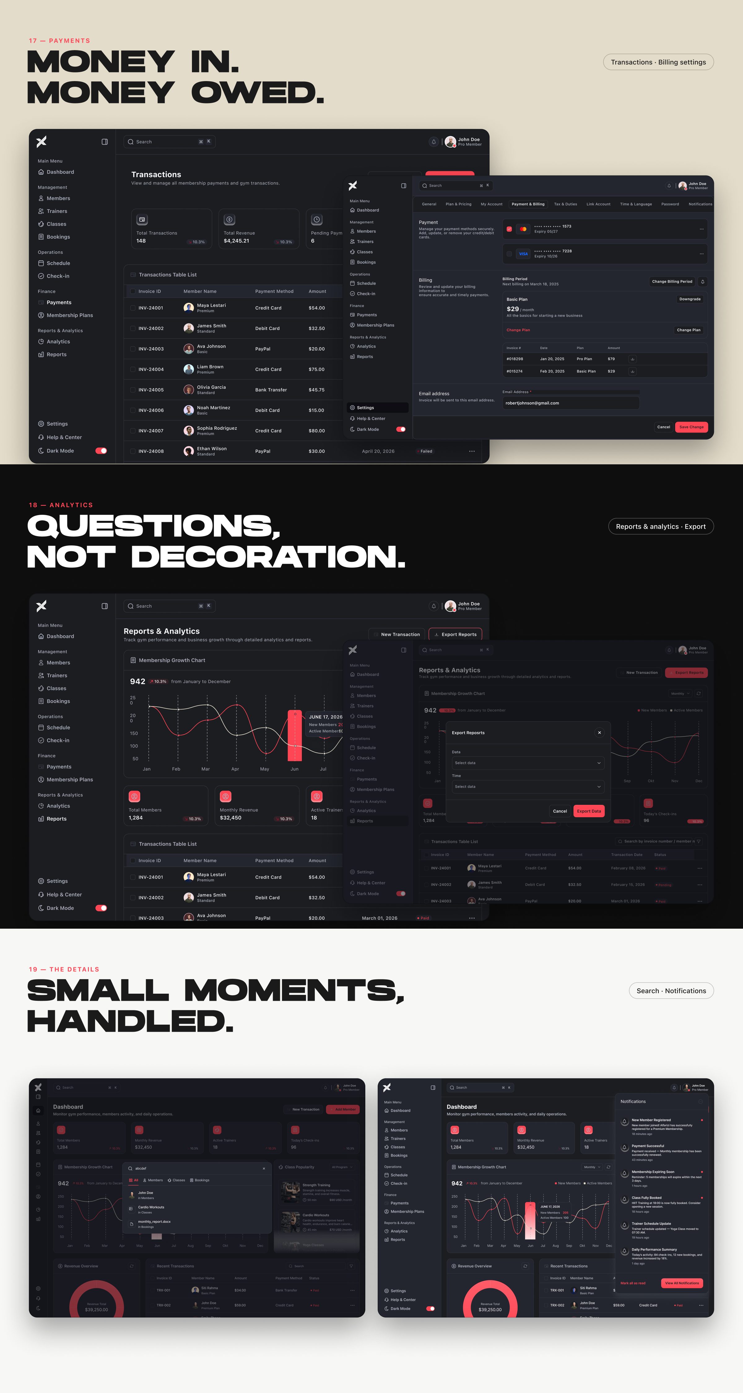
FRAME 18 // 22 PRODUCT — PROTOTYPE: MONEY & DETAILS

Money in. Money owed.

Payments, analytics, search and notifications: questions, not decoration; small moments, handled.

Payments, analytics, search and notifications screens.
Click to zoom & inspect
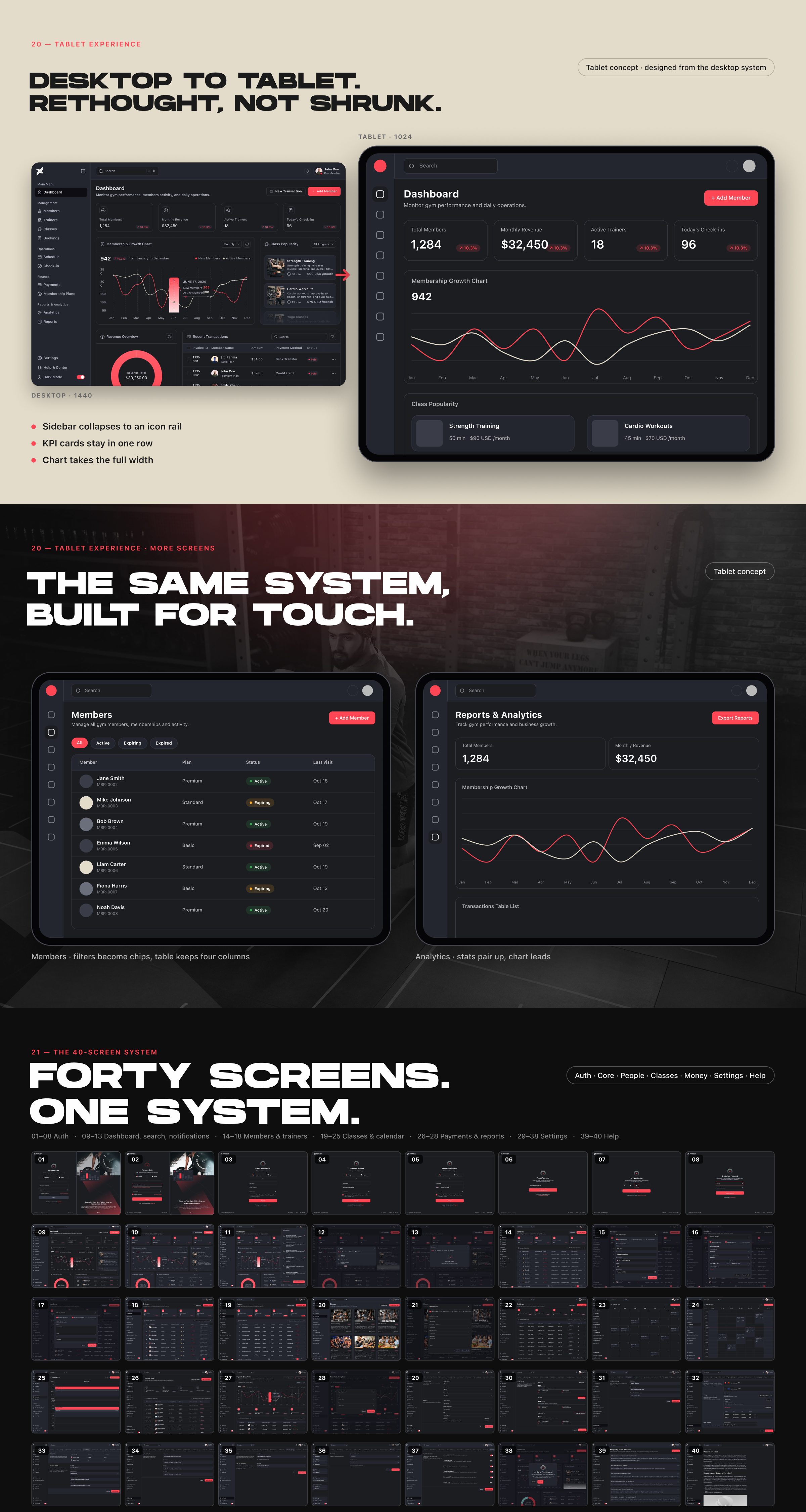
FRAME 19 // 22 PRODUCT — PROTOTYPE: TABLET & SCALE

Forty screens. One system.

Desktop to tablet. Rethought, not shrunk. The same system, built for touch.

Tablet screens and the overview of all 40 screens.
Click to zoom & inspect
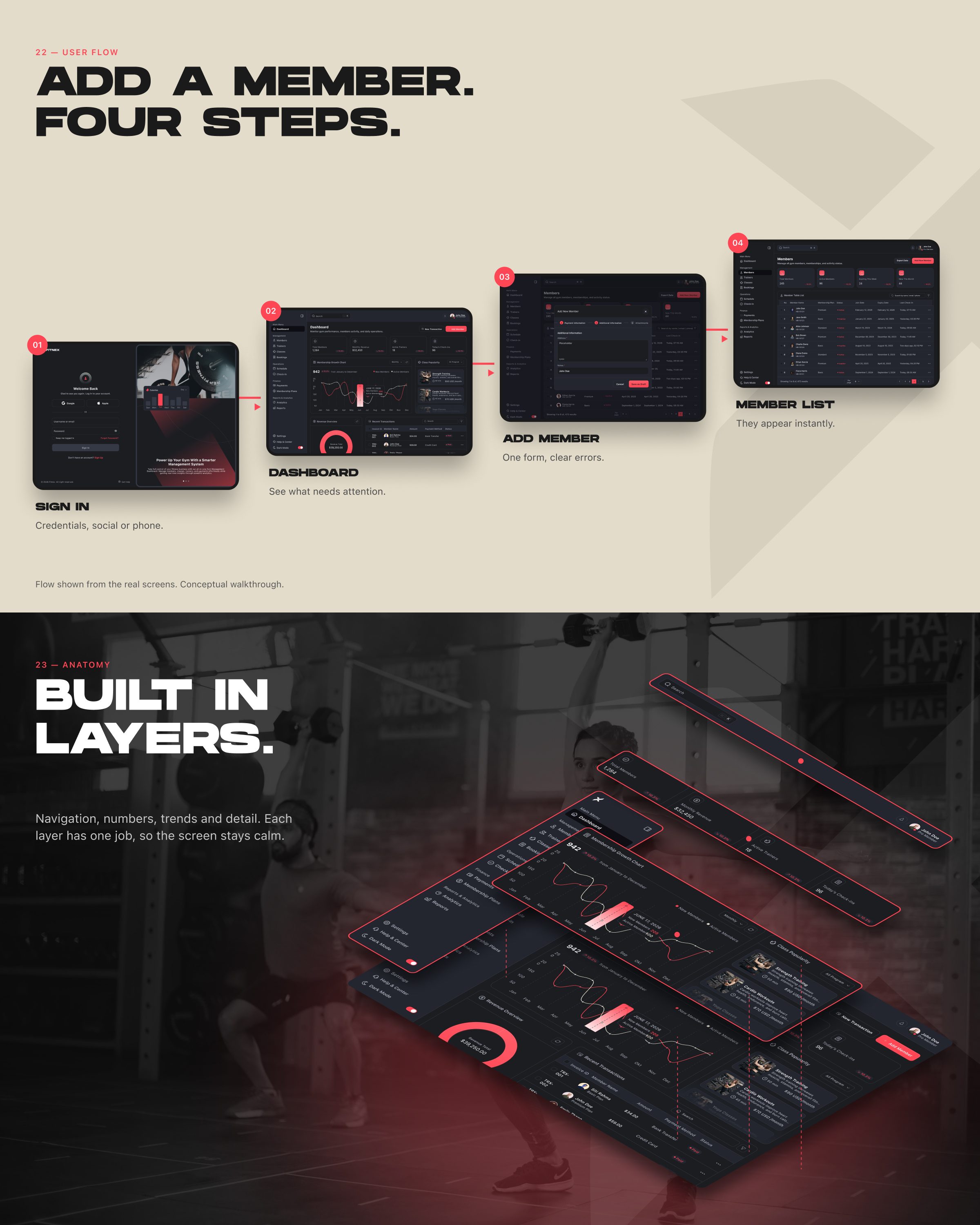
FRAME 20 // 22 PRODUCT — PROTOTYPE: FLOW & ANATOMY

Add a member. Four steps.

Built in layers: navigation, numbers, trends and detail. Each layer has one job, so the screen stays calm.

Four-step add-member flow and an exploded view of the dashboard layers.
Click to zoom & inspect
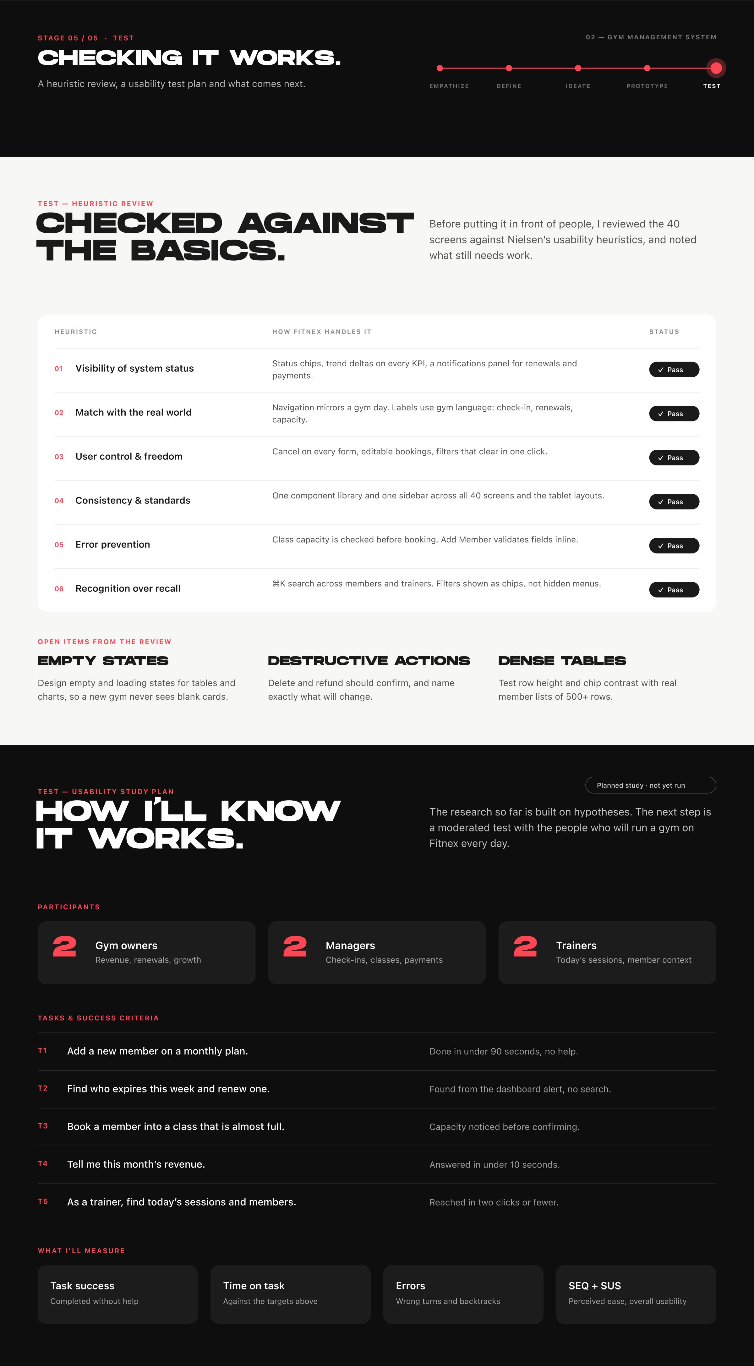
FRAME 21 // 22 PRODUCT — TEST

Checked against the basics.

A heuristic review of the 40 screens against Nielsen’s usability heuristics, a usability test plan, and what comes next.

Product test: heuristic review and usability test plan.
Click to zoom & inspect
CHAPTER 06

Outcome

FRAME 22
FRAME 22 // 22 OUTCOME & REFLECTION

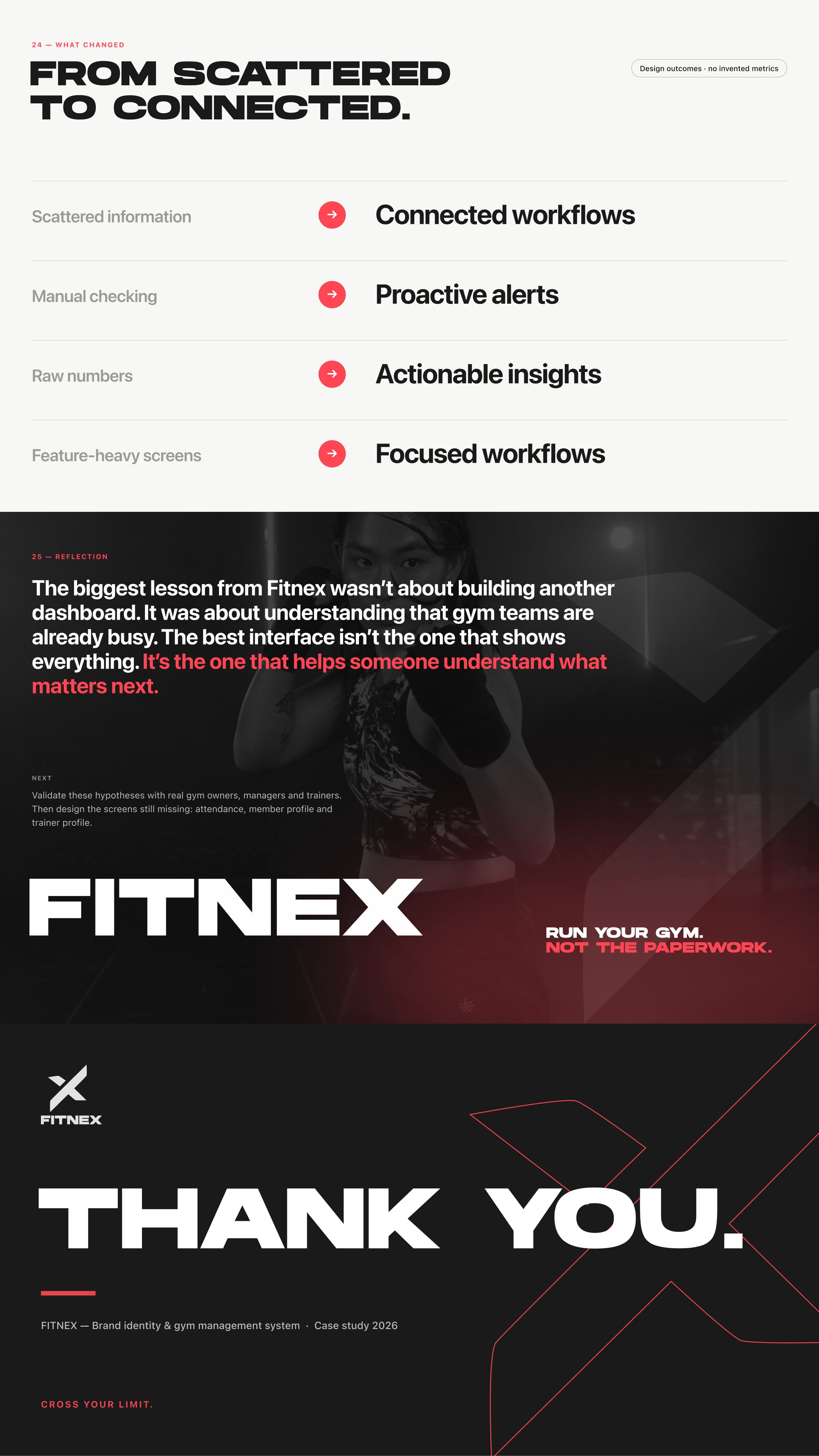
From scattered to connected.

The best interface isn’t the one that shows everything. It’s the one that helps someone understand what matters next.

Outcome and reflection: what changed, the main lesson, next steps, and thank you.
Click to zoom & inspect